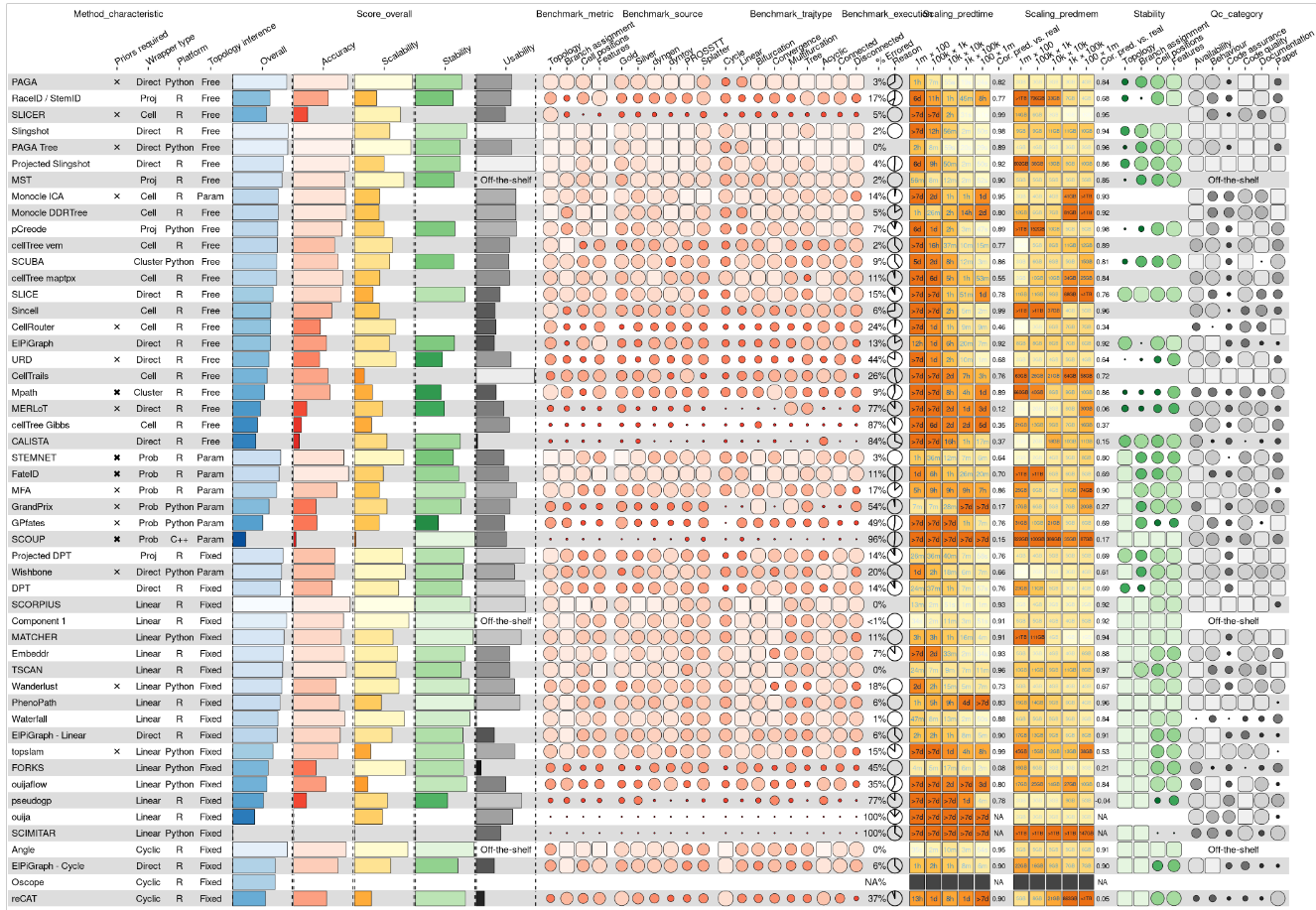
1
2
3
4
5
6
7
8
9
10
11
12
13
14
15
16
17
18
19
20
21
22
23
24
25
26
27
28
29
30
31
32
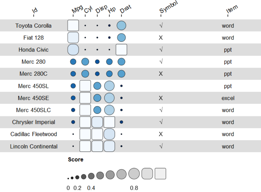
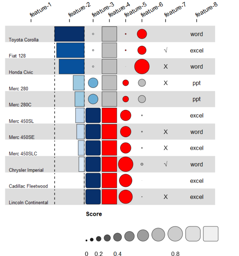
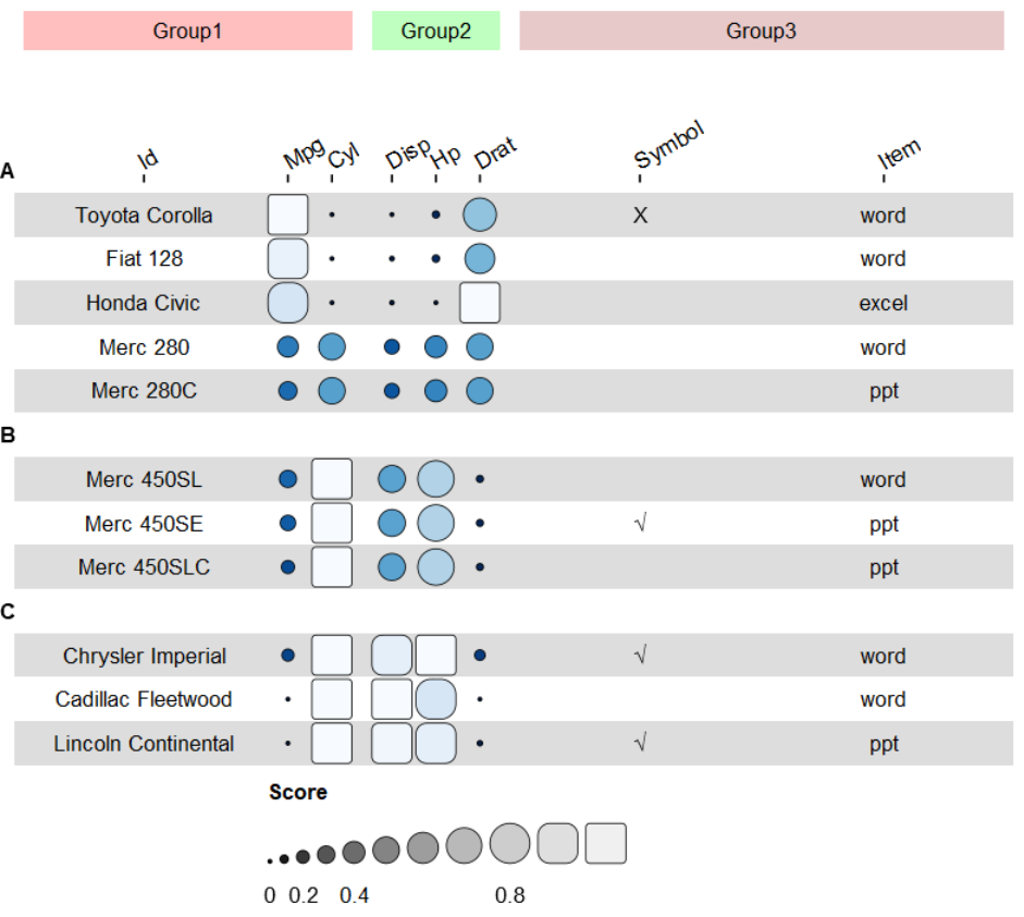
|
data <- mtcars[10:20,1:5] %>%
  rownames_to_column("id") %>%
  arrange(desc(mpg))
data$symbol =sample(c("X","√",""),11,replace=T)
data$item =sample(c("word","ppt","excel"),11,replace=T)
#通过column_info设置每一列方案
column_info = data.frame(
	id = colnames(data),
	#设置每列的标签名
	name = paste0("feature-",seq(ncol(data))),
	# #设置列的分组情况
	# group = c(rep("group1",3),rep("group2",3),rep("group3",2)),
	#设置每列的可视化类型 "funkyrect", "circle", "rect", "bar", "pie", or "text"
	geom = c("text", "bar","funkyrect","rect","circle","circle","text","text"),
	#设置每列的颜色方案
	palette = c(NA, "palette1","palette1","palette2","palette3","palette2",NA,NA),
	#设置每列的宽度
	width = c(3,2,1,1,1,1,2,2)
	)
# 此外也可通过option的list列单独设置,支持所有参数
# 对于text列:size,hjust,vjust可分别设置字体大小,左右对齐,上下对齐
# 对于bar列:hjust可分别设置柱子的左右对齐
column_info$options = list(list(size=3,hjust=0,vjust=0),list(hjust=1),list(),list(),list(),list(),list(),list())

palettes = list(
	# 本质通过两个或者两个以上颜色,设置渐变色
	palette1 = RColorBrewer::brewer.pal(n = 9, name = "Blues"),
	palette2 = c("grey","red"),
	palette3 = c("red","red")
	)

funky_heatmap(data, column_info = column_info, palettes = palettes)
|