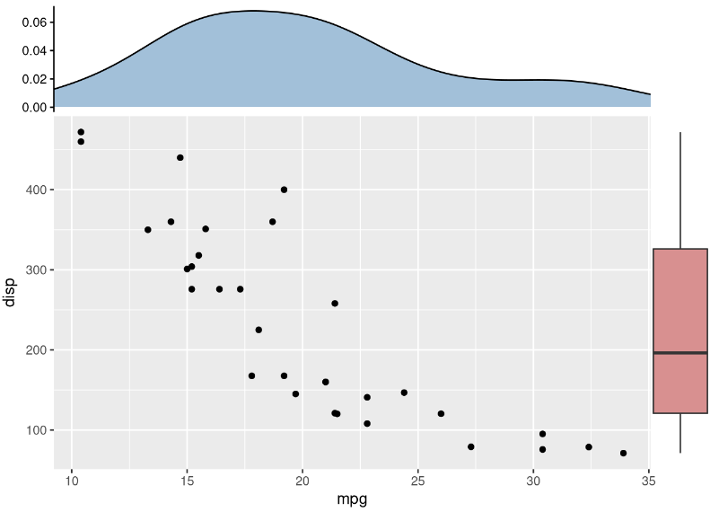
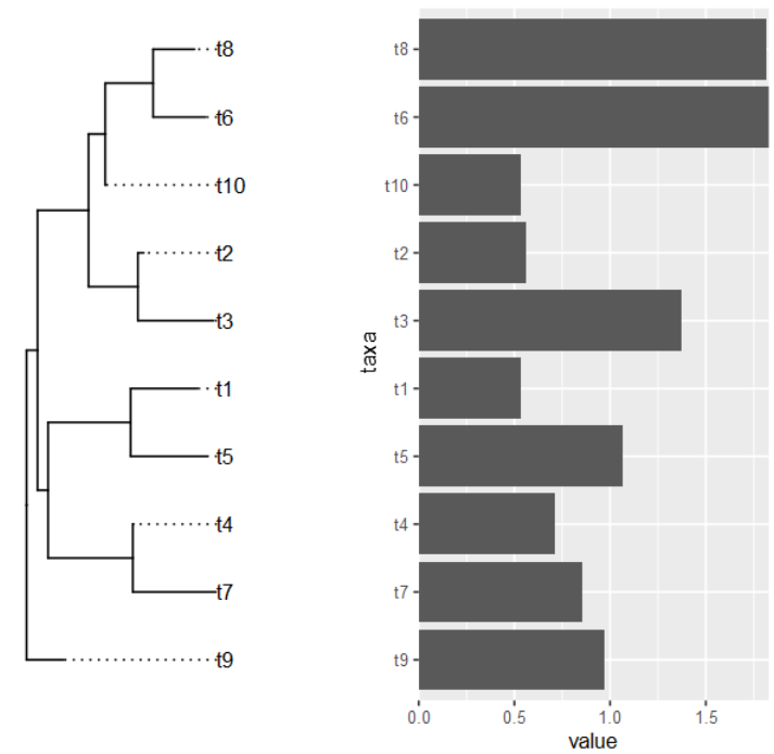
 1
 2
 3
 4
 5
 6
 7
 8
 9
10
11
12
13
14
15
16
17
18
19
20
21
22
23
24
25
26
27
28
29
30
31
32
33
34
35
36
37
38
39
40
41
42
43
44
45
46
47
48
49
50
51
52
53
54
55
56
57
58
59
60
61
|
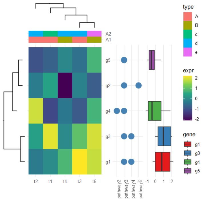
# 模拟表达矩阵
d <- matrix(rnorm(25), ncol=5)
rownames(d) <- paste0('g', 1:5)
colnames(d) <- paste0('t', 1:5)
## 宽变长
dd <- data.frame(d)
dd$gene <- rownames(d)
dd <- gather(dd, 1:5, key="condition", value='expr')

# 主图:表达热图
p <- ggplot(dd, aes(condition,gene, fill=expr)) + geom_tile() +
  scale_fill_viridis_c() +
  scale_y_discrete(position="right") +
  theme_minimal() +
  xlab(NULL) + ylab(NULL)

# 聚类热图:分别对基因(行)/样本(列)
hc <- hclust(dist(d)) # 基因
phr <- ggtree(hc)
hcc <- hclust(dist(t(d))) # 样本
phc <- ggtree(hcc) + layout_dendrogram()

# 样本注释
ca <- data.frame(condition = paste0('t', 1:5),
                 A1 = rep(LETTERS[1:2], times=c(3, 2)),
                 A2 = rep(letters[3:5], times=c(1, 3, 1))
)
cad <- gather(ca, A1, A2, key='anno', value='type')
pc <- ggplot(cad, aes(condition, y=anno, fill=type)) + geom_tile() +
  scale_y_discrete(position="right") +
  theme_minimal() +
  theme(axis.text.x = element_blank(),
        axis.ticks.x = element_blank()) +
  xlab(NULL) + ylab(NULL)
# 基因注释1:表达范围
g <- ggplot(dplyr::filter(dd, gene != 'g2'), aes(gene, expr, fill=gene)) +
  geom_boxplot() + coord_flip() +
  scale_fill_brewer(palette = 'Set1') +
  theme_minimal() +
  theme(axis.text.y = element_blank(),
        axis.ticks.y = element_blank(),
        panel.grid.minor = element_blank(),
        panel.grid.major.y = element_blank()) +
  xlab(NULL) + ylab(NULL)

# 基因注释2:所属通路
dp <- data.frame(gene=factor(rep(paste0('g', 1:5), 2)),
                 pathway = sample(paste0('pathway', 1:5), 10, replace = TRUE))
pp <- ggplot(dp, aes(pathway, gene)) +
  geom_point(size=5, color='steelblue') +
  theme_minimal() +
  theme(axis.text.x=element_text(angle=90, hjust=0),
        axis.text.y = element_blank(),
        axis.ticks.y = element_blank()) +
  xlab(NULL) + ylab(NULL)

p %>% insert_left(phr, width=.3) %>%
  insert_right(pp, width=.4)  %>%
  insert_right(g, width=.4) %>%
  insert_top(pc, height=.1) %>%
  insert_top(phc, height=.2)
|