ggplot2包一方面可以实现多种形式的数据可视化、比如箱图、柱状图等;另一方面也可以从多个角度进行美化、修饰。对于前者,之前对ggplot2的柱状图、箱图用法进行了详细的学习。关于其它类型的图,例如密度图、折线图、直方图等,可参考他人的总结,例如下面的sthda网站。
R-ggplot2-箱图系列(1) basic - 简书 (jianshu.com)
R-ggplot2-柱状图系列 - 简书 (jianshu.com)
http://www.sthda.com/english/wiki/ggplot2-essentials
本篇笔记主要是针对我自己在绘制ggplot图片时,常常要修改的细节方面进行了大致的整理,以方便日后的查询。
|
|
1、颜色设置
|
|
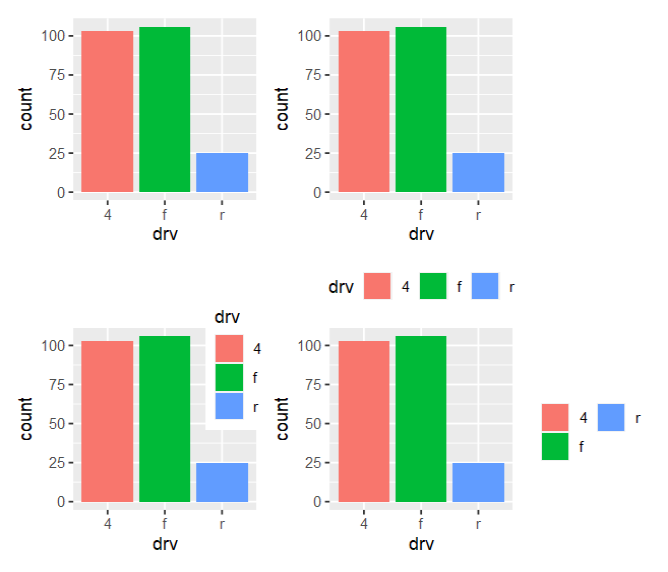
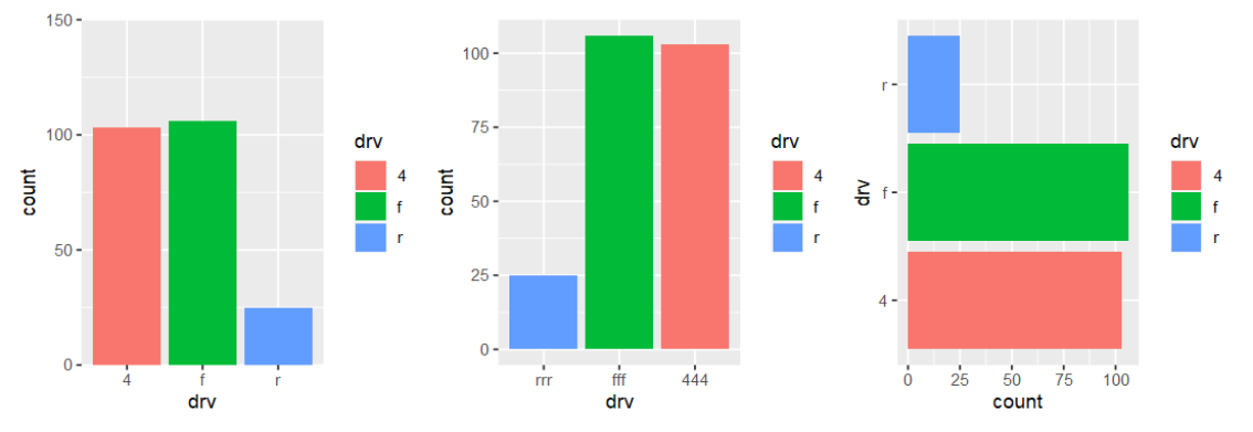
1.1 离散型变量映射
|
|
- (1)
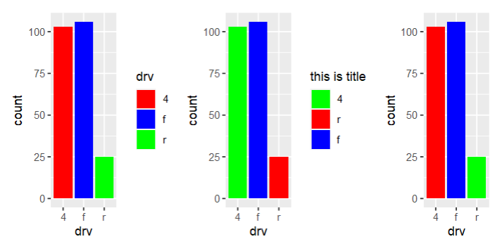
scale_fill_manual()
|
|
- (2)
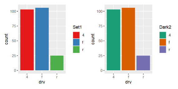
scale_fill_brewer()
|
|
|
|
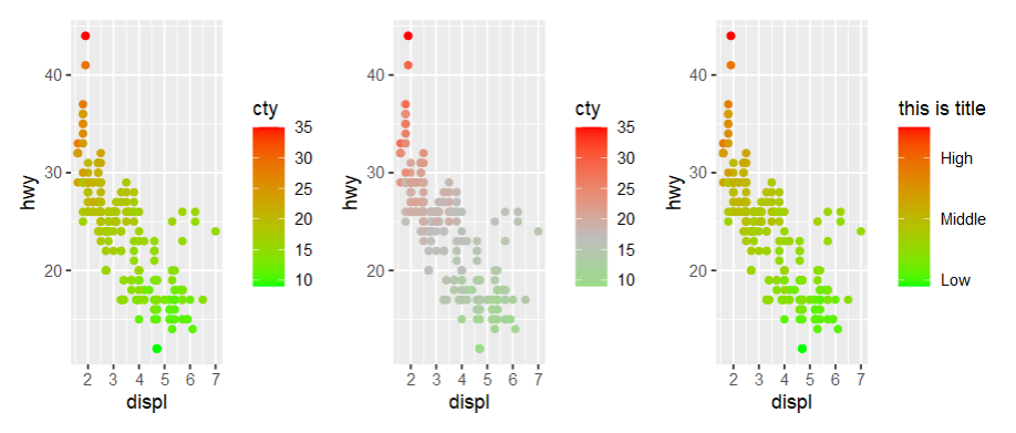
1.2 连续型变量映射
|
|
|
|
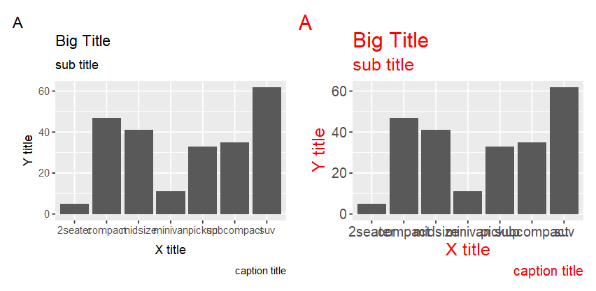
2、文本格式设置

常用参数有如下
size:大小
colour:颜色
angle:旋转(rotate)角度
hjust/vjust:位置
face:设置粗体
family:设置字体
|
|
|
|
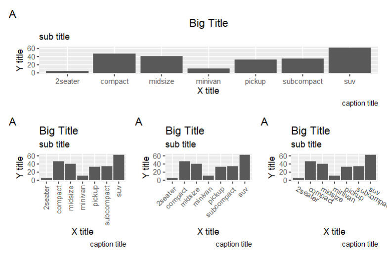
3、坐标轴设置
|
|
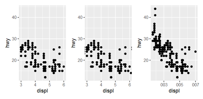
|
|
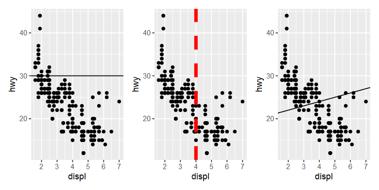
4、添加注释
4.1 文本注释
|
|
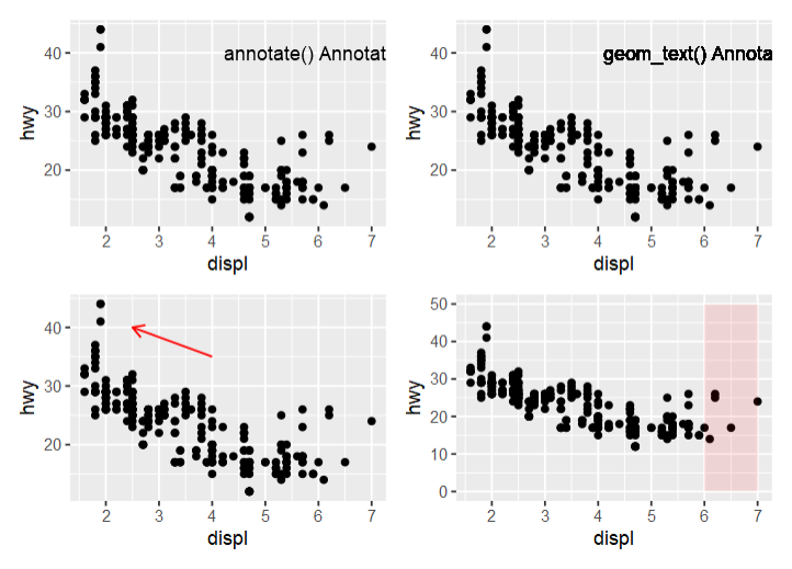
4.2 直线注释
|
|
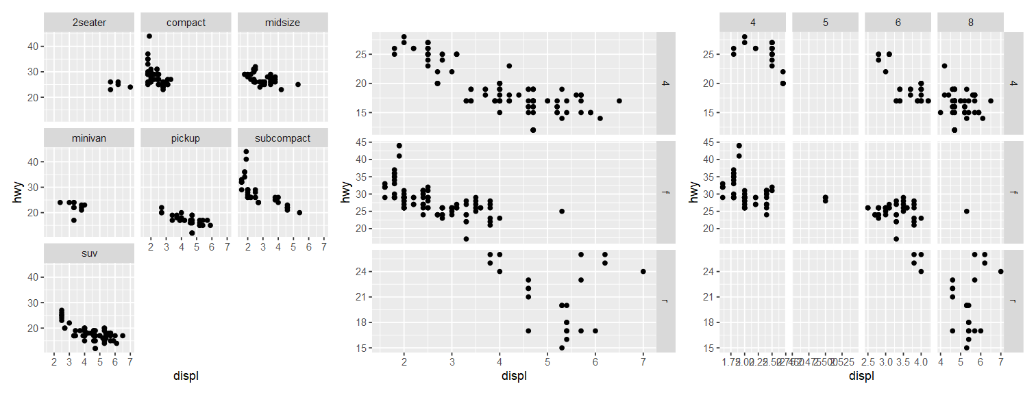
5、分面多图
|
|
6、图例设置
|
|