https://pandas.pydata.org/docs/reference/api/pandas.DataFrame.plot.html
pandas的dataframe自带一些绘图语法用以简单的表格数据可视化,适合于数据的初步探索、分析
|
|
1、barplot柱状图
|
|

|
|
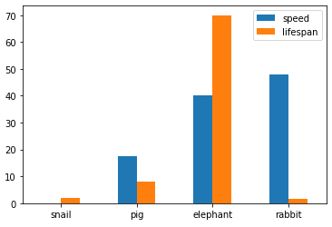
pandas.DataFrame.plot.barh()支持绘制横向的柱状图(Dataframe数据内容需要是横向的)
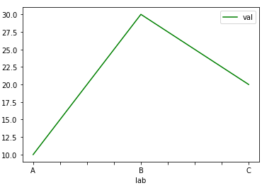
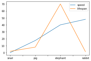
2、lineplot线图
(类似上面的barplot)
|
|
|
|
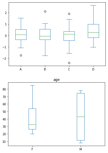
3、boxplot箱图
|
|
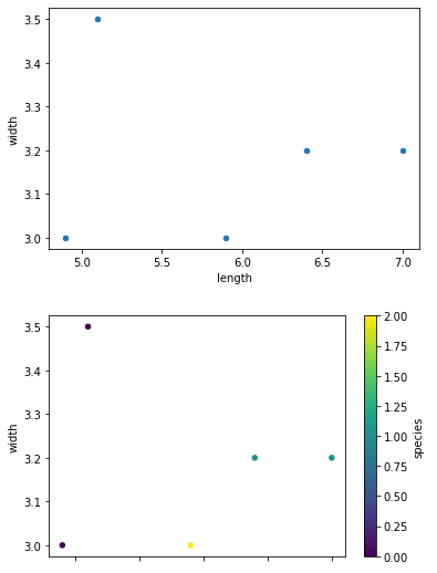
4、scatter点图
|
|
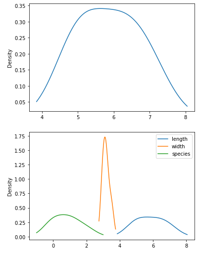
5、density密度图
|
|