肿瘤预后类文章的常规步骤之一是绘制诺模图,并进行相关分析。以下总结了相关基础绘制工具。

  • 示例数据集
1
2
3
4
5
6
library(survival)
head(lung)
#   inst time status age sex ph.ecog ph.karno pat.karno meal.cal wt.loss
# 1    3  306      2  74   1       1       90       100     1175      NA
# 2    3  455      2  68   1       0       90        90     1225      15
# 3    3 1010      1  56   1       0       90        90       NA      15

1、rms包

  • 参考用法:https://atm.amegroups.com/article/view/14736/15089
 1
 2
 3
 4
 5
 6
 7
 8
 9
10
11
12
13
14
15
16
17
18
19
20
21
22
23
24
25
26
27
28
29
30
31
32
33
34
35
36
37
38
39
40
library(rms)
# var.labels = c(age="Age in Years",
#                lac="lactate",
#                sex="Sex of the participant",
#                shock="shock",
#                y="outcome",
#                Y="ordinal")
# label(data) = lapply(names(var.labels),
#                      function(x) label(data[,x]) = var.labels[x])

mod.cox <- cph(Surv(time,status) ~ ph.ecog+sex+age,lung, surv=TRUE)
ddist <- datadist(lung)
options(datadist='ddist')
surv.cox <- Survival(mod.cox)

# 定义函数
med <- Quantile(mod.cox)
surv <- Survival(mod.cox)

nom.cox <- nomogram(mod.cox,
                   # 根据total point进行特定函数计算
                   fun=list(function(x) surv.cox(365, x),   # 一年生存率
                            function(x) med(lp=x, q=0.5)),  # 中位生存时间
                   funlabel=c("200-Day Sur. Prob.",
                              "Median Survival Time"),
                   lp=F, # 不展示Linear Predictor
                   conf.int=c(0.1,0.5) # 两个置信区间
)

plot(nom.cox,
     col.conf=c('red','green'),     # 置信区间的颜色
     col.grid = c("grey30","grey")  # 网格的颜色
     )
# f = cph(Surv(time, status) ~ age + sex + ph.karno, data = lung,
#         x = T, y = T, sur = T)
# pred_score = apply(lung, 1, function(x){
#   pred=Predict(f, age=x["age"], sex=x["sex"], ph.karno=x["ph.karno"])
#   return(pred$yhat)
# }) %>% unlist()
# summary(pred_score)
image-20230428113638766
 1
 2
 3
 4
 5
 6
 7
 8
 9
10
11
12
13
14
15
16
17
18
19
20
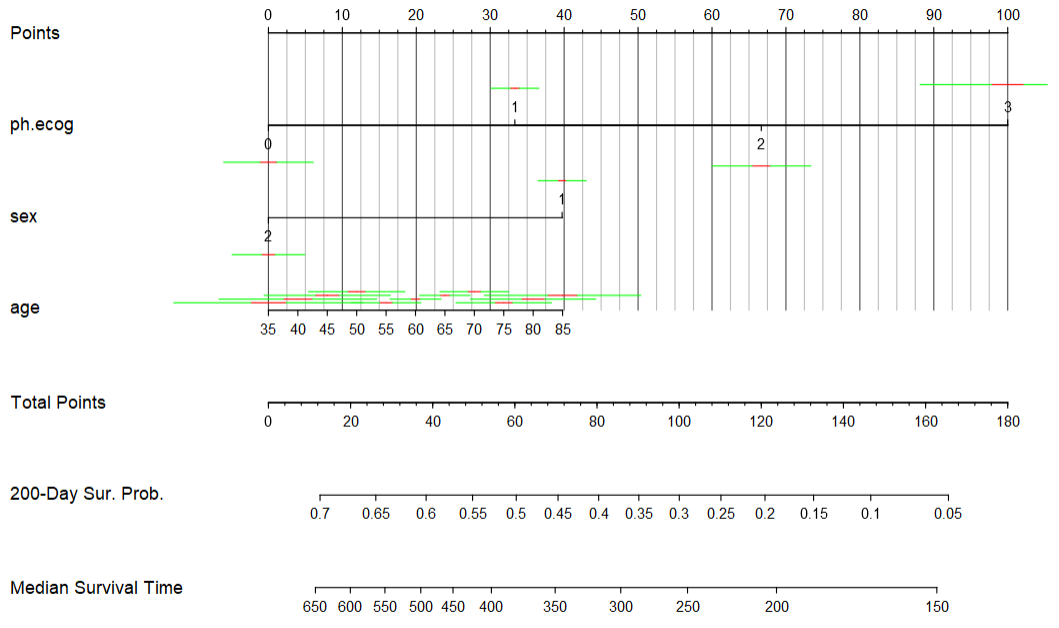
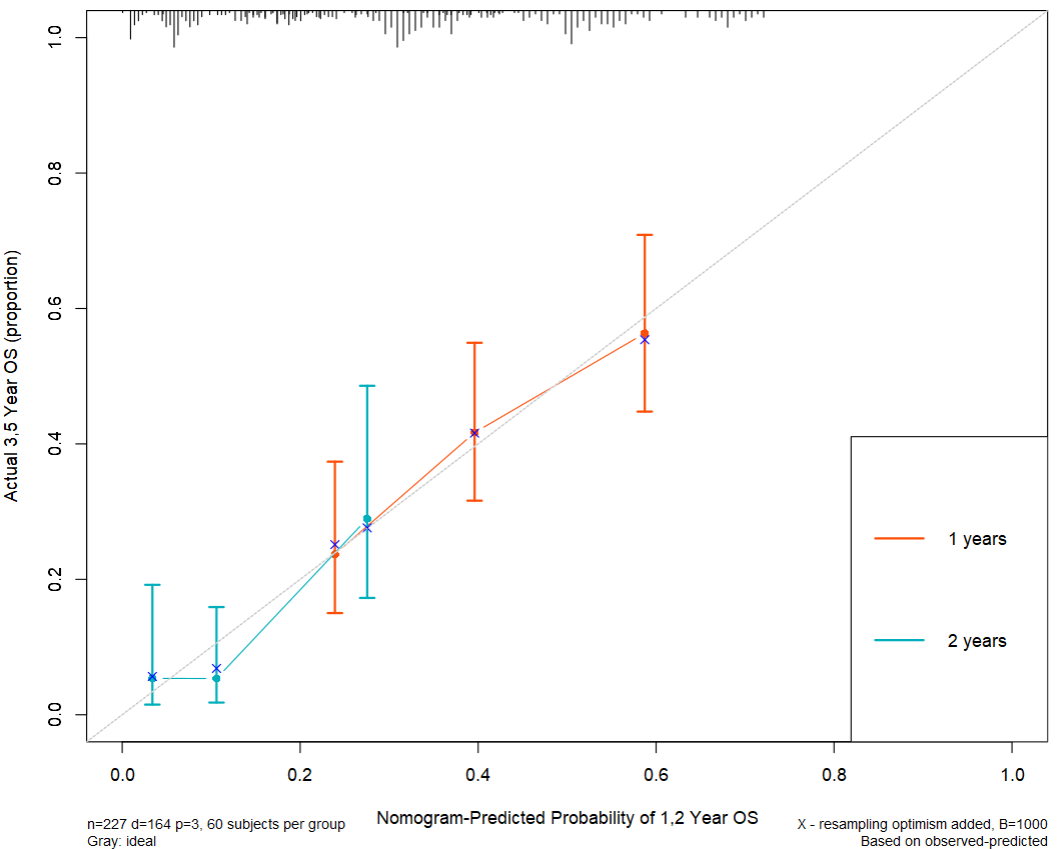
mod.cox.1 <- cph(Surv(time,status) ~ ph.ecog+sex+age,lung, x=T,y=T,surv = T, time.inc = 365)
cal1 <- calibrate(mod.cox.1, cmethod='KM', method="boot", u=365, m=60, B=1000) 
mod.cox.2 <- cph(Surv(time,status) ~ ph.ecog+sex+age,lung, x=T,y=T,surv = T, time.inc = 365*2)
cal2 <- calibrate(mod.cox.2, cmethod='KM', method="boot", u=365*2, m=60, B=1000) 

par(mar=c(7,5,1,1),cex = 0.75) 
plot(cal1,lwd=2,lty=1, 
     errbar.col="#FC4E07", #线上面的竖线
     xlim=c(0,1),ylim=c(0,1), 
     xlab="Nomogram-Predicted Probability of 1,2 Year OS", 
     ylab="Actual 1,1 Year OS (proportion)", 
     col="#FC4E07") 
plot(cal2, add=T, conf.int=T, 
     subtitles = F, cex.subtitles=0.8, 
     lwd=2, lty=1, errbar.col="#00AFBB", col="#00AFBB") 
#加上图例 
legend("bottomright", legend=c("1 years", "2 years"), 
       col=c("#FC4E07","#00AFBB"), lwd=2) 
#调整对角线 
abline(0,1,lty=3,lwd=1,col="grey") 
image-20230428130451931

2、regplot包

 1
 2
 3
 4
 5
 6
 7
 8
 9
10
11
library(regplot)
lung2 = lung
lung2$sex = factor(lung2$sex)
mod.cox <- coxph(Surv(time,status) ~ ph.ecog+sex+age,lung2)
regplot(mod.cox, points=TRUE,
        plots=c("density","boxes"),  # 连续型与离散型的可视化
        dencol="green", boxcol="yellow",
        observation=lung2[15,], droplines=TRUE, # 对特定样本的可视化打分
        title="Survival Nomogram",
        prfail=T,  # 生存T/死亡F  
        failtime=c(366,731,1000))
image-20230428114055003