0、示例数据
|
|
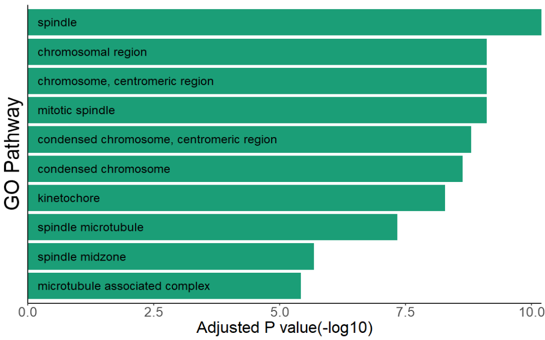
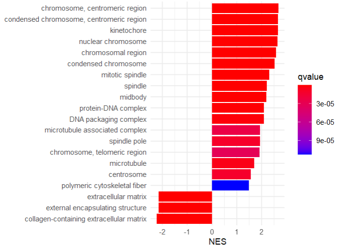
1、ggplot2
|
|
|
|
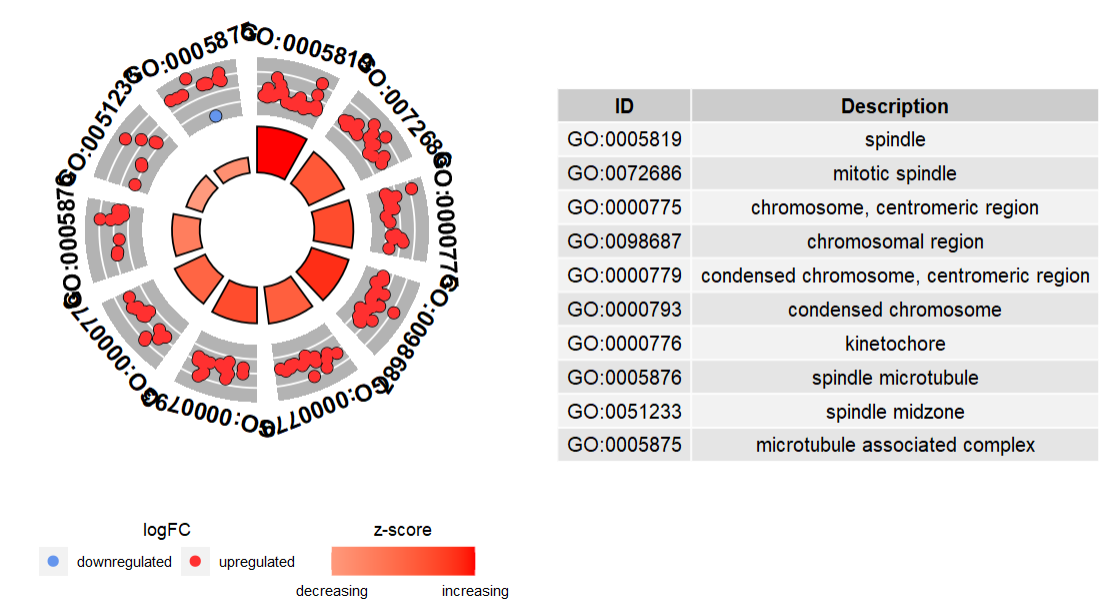
2、GOplot
- 官方教程:https://wencke.github.io/
|
|
-
Circular visualization
此种绘图方式,ID列为required
|
|
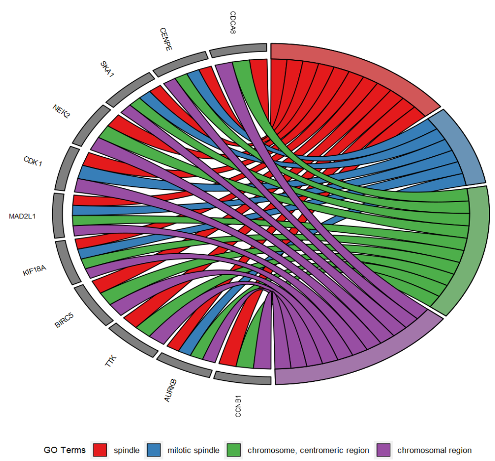
- Chord visualization
|
|
|
|
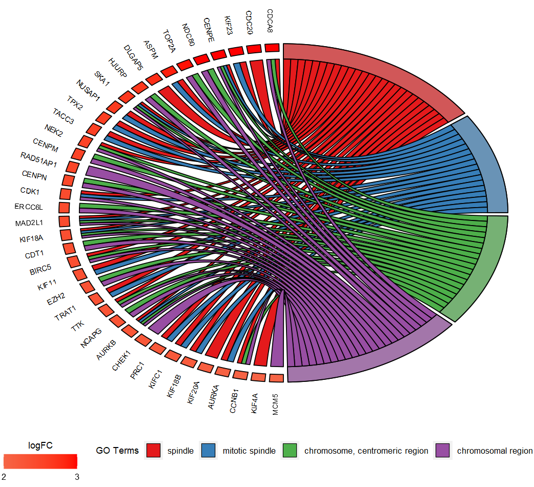
|
|
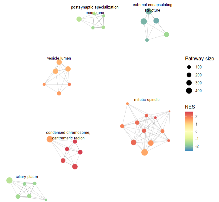
3、aPEAR
-
参考:https://github.com/ievaKer/aPEAR, https://cran.r-project.org/web/packages/aPEAR/vignettes/aPEAR-vignette.html
-
简介:该包可针对富集分析结果进行通路聚类,得到若干cluster,然后再进行网络图可视化。
|
|
该包的一个核心函数是enrichmentNetwork(),其需要的主要参数是表示富集分析的数据框。需要包含如下几列
-
Description:描述通路的含义;
-
pathwayGenes:通路的组成基因。
it will be used to calculate the similarities between the pathways. It can be leading edge genes or the full gene list. The ID type (Ensembl, Gene symbol, etc.) does not matter but should be the same between all the pathways. The genes should be separated by “/”.
-
通路富集程度的列,可以为P值;对于GSEA结果也可以是NES;
-
通路基因数目的列。
|
|
此外还有其它参数可以调整,包括聚类、颜色等
- 计算通路相似度方法 simMethod = c(“jaccard”, “cosine”, “cor”)
- 聚类算法 clustMethod = c(“markov”, “hier”, “spectral”)
- 类别名 clustNameMethod = c(“pagerank”, “hits”, “none”)
- 筛选类-每类包含的最小通路数目 minClusterSize = 2
- 认为类别内/间,通路相似的阈值 innerCutoff/outerCutoff
|
|