cellDancer是美国休斯顿卫理公会研究所的助理教授Guangyu Wang团队开发的RNA速率分析新工具,于2023年4月发表于nature biotechnology。该工具基于深度学习框架预测细胞特异的速率参数(α, β and γ),相较于之前的scvelo等RNA速率分析工具可有效预测 transcriptional boost, multi-lineage forward, multi-lineage backward等复杂情况下的单细胞数据发育预测分析。
- Paper:https://www.nature.com/articles/s41587-023-01728-5
- Github:https://github.com/GuangyuWangLab2021/cellDancer
- Tutorial:https://guangyuwanglab2021.github.io/cellDancer_website
文章概述
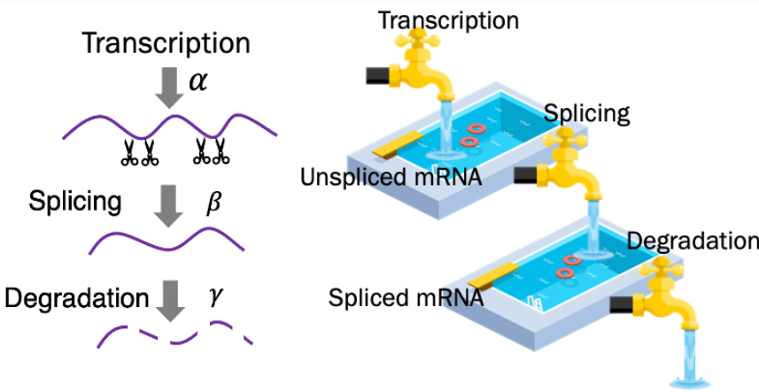
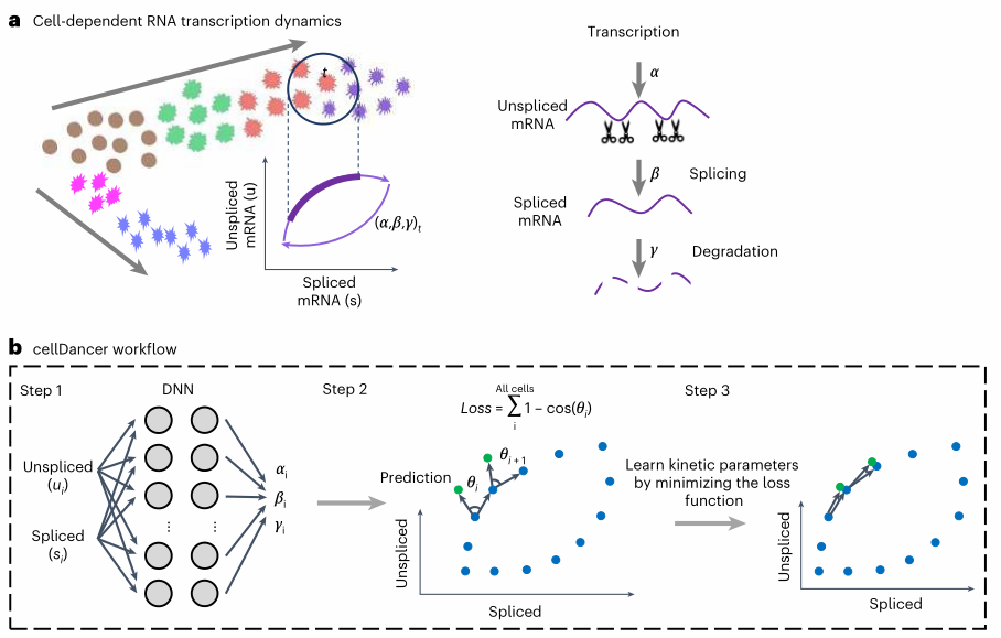
(1)模型算法简介
- 首先根据velocity算法计算出每个细胞的每个基因的unspliced与spliced丰度;
- 然后将其作为DNN神经网络的输入层,模型输出是3个速率参数;
- 再根据预测的参数计算该基因未来下一状态的unspliced与spliced丰度;
- 将计算的unspliced与spliced丰度与该基因所在细胞的邻居unspliced与spliced丰度相似度作为损失函数指标;
- 在不断优化迭代过程中,得到每个细胞中每个基因的最佳速率参数;
- 基于上述得到的速率参数,进行后续的下游分析,例如细胞速率推测,伪时间分析等。
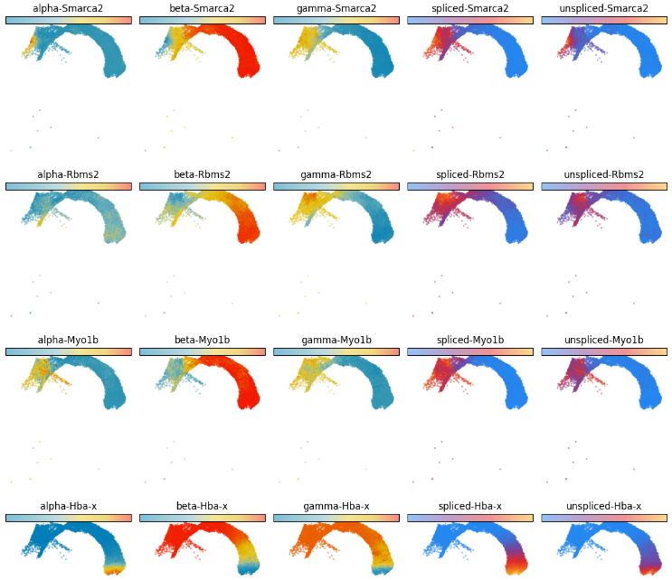
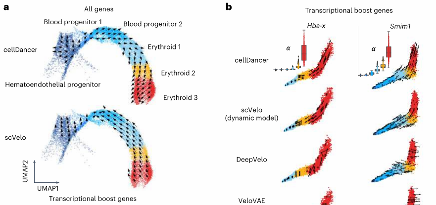
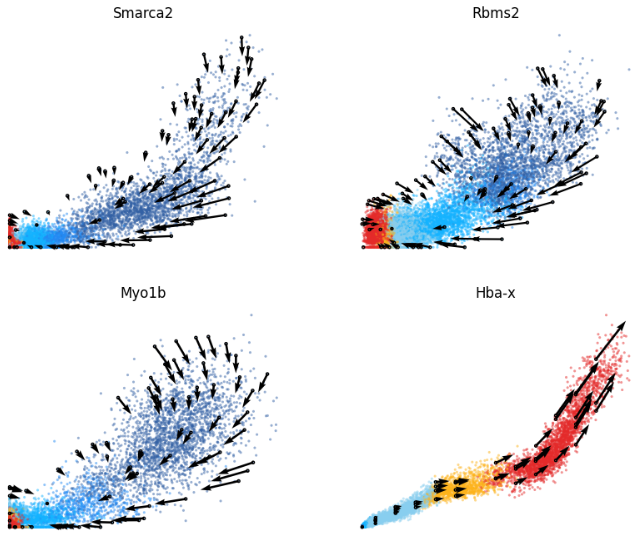
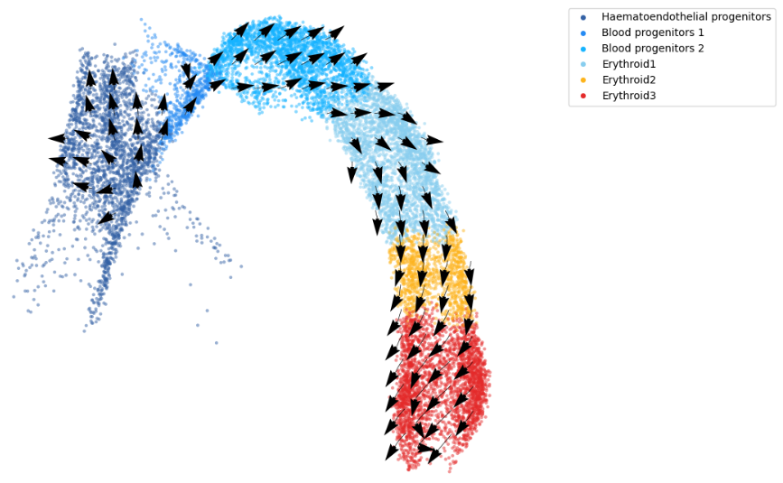
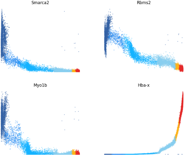
(2)复杂情况数据–transcription boost
- Transcriptional boost refers to a boost in the expression induced by a change in the transcription rate.即基因在发育过程出现异常的激活
- Barile鉴定了89个在红系细胞分化过程中出现transcription boost现象的基因。
- 这些基因会导致传统工具(scVelo)导致错误的预测,而cellDancer而进行有效的处理
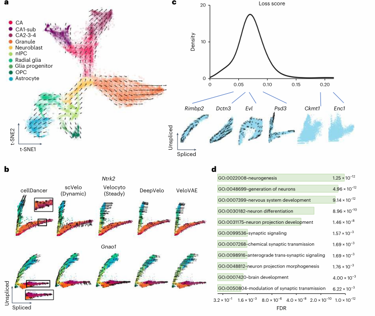
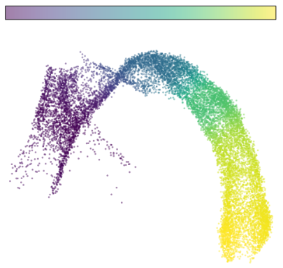
(3)复杂情况数据–multi-lineage异质性
- 小鼠海马体有5个发育分支谱系,分别是
- dentate gyrus granule neurons
- pyramidal neurons in subiculum and CA1
- pyramidal neurons in CA2/3/4
- oligodendrocyte precursors (OPCs)
- astrocyte
- 由于在不同分支中,基因可能有不同的表达模式,称为branching gene
- branching gene在不同分支中具有multiple dynamics;与之相对的则只有mono-kinetic
- 如下图所示 cellDancer不仅能够正确预测细胞发育轨迹,也能正确鉴定出branching genes
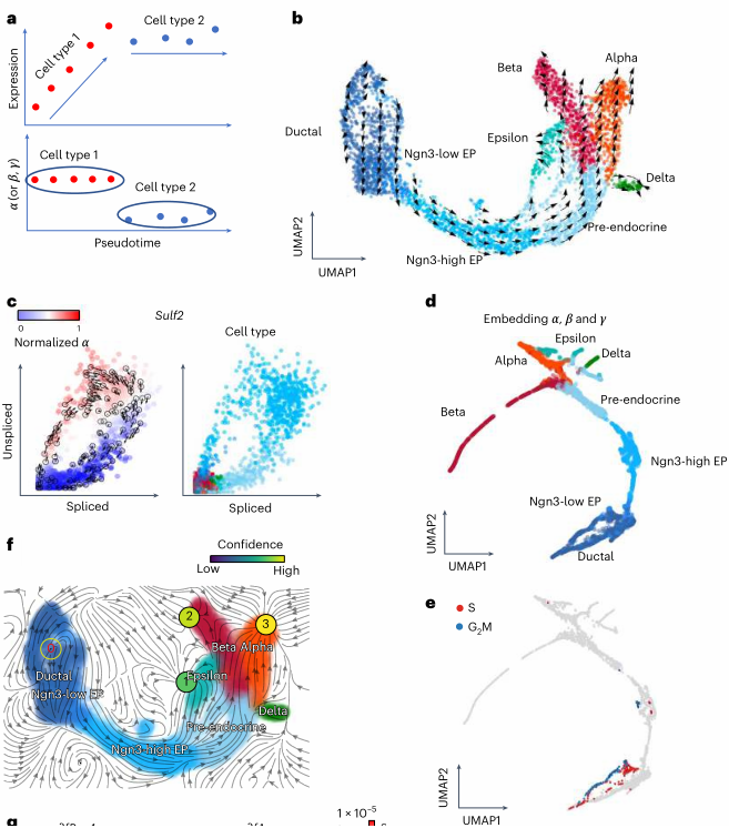
(4)衍生用法的介绍
- 小鼠胰腺可发育成4种细胞类型,简称为alpha-, beta-, delta-,epsilon-cells
- cellDancer在进一步预测发育轨迹的基础上,可使用每个细胞的每个基因的3个速率参数作为鉴定细胞类型的方式之一
- 此外cellDancer的分析结果也可无缝衔接到dynamo分析框架,进行多样的后续下游分析。
此外文章进一步结合scEU-seq数据等角度验证cellDancer分析结果的可靠性、鲁棒性等,在此就不记录了,具体看阅读原文。
软件用法
-
作者提供了一个全面的教程资源以及示例数据可供学习;
https://guangyuwanglab2021.github.io/cellDancer_website/
-
在此以其中一个示例数据学习其主要的使用方法。
-
根据教程,搭建conda环境,并下载示例数据(Case 1)
1
2
3
4
conda create -n cellDancer python==3.7.6 conda activate cellDancer pip install celldancer # jupyter lab 环境下分析
|
|
(1)读取上游velocyto/Seurat分析结果
- (1) 每个细胞的每个基因的 unsplice与splice比例
- (2) 细胞的分群与UMAP降维结果
|
|
(2)每个细胞的每个基因速率分析
|
|
(3)根据上述所有基因的结果进行细胞速率分析
|
|
(4)伪时间分析
|
|
|
|
|
|