一、monocle#
(1)http://cole-trapnell-lab.github.io/monocle-release/docs/#constructing-single-cell-trajectories
(2)http://events.jianshu.io/p/5d6fd4561bc0 单细胞之轨迹分析-2:monocle2 原理解读+实操
(3)https://www.jianshu.com/p/7c3e4370bd4c
Monocle introduced the strategy of ordering single cells in pseudotime, placing them along a trajectory corresponding to a biological process such as cell differentiation by taking advantage of individual cell’s asynchronous progression of those processes.
最近使用monocle包的orderCells() 函数出现了问题,发现有人已在github提出了相应的解决方案,并提供了更新后的包的源代码。
https://github.com/cole-trapnell-lab/monocle-release/issues/434
https://github.com/cole-trapnell-lab/monocle-release/files/10134172/monocle_2.26.0.tar.gz
基于上述,总结安装经验如下
1
2
3
4
5
6
7
8
9
|
# step1:按照正常方式安装monocle包(2.26.0),以安装相关依赖包
BiocManager::install("monocle")

# step2:单独卸载monocle包
remove.packages("monocle")

# step3: 手动安装上述修改好的monocle包
install.packages("monocle_2.26.0.tar.gz", repos = NULL)
library(monocle)
|
0、Seurat前期分析#
建议在完成Seurat对象完成前期的细胞注释等步骤后,再无缝对接monocle的分析流程
 1
 2
 3
 4
 5
 6
 7
 8
 9
10
11
12
13
14
15
16
17
18
19
20
21
22
23
24
25
26
27
28
29
30
31
32
33
34
|
## 下载示例数据
download.file("https://s3-us-west-2.amazonaws.com/10x.files/samples/cell/pbmc3k/pbmc3k_filtered_gene_bc_matrices.tar.gz",
              "pbmc3k_filtered_gene_bc_matrices.tar.gz")
untar("pbmc3k_filtered_gene_bc_matrices.tar.gz")
library(Seurat)
sce <- Read10X(data.dir = "filtered_gene_bc_matrices/hg19/")
sce <- CreateSeuratObject(sce)
sce = sce %>%
  NormalizeData() %>%
  FindVariableFeatures() %>%
  ScaleData()
sce = sce %>%
  RunPCA() %>%
  RunUMAP(dims = 1:30) %>%  #RunTSNE
  FindNeighbors(dims = 1:30) %>%
  FindClusters(resolution = c(0.1,0.5,0.8))

# 注释细胞类型(随便虚拟命名)
Idents(sce)="RNA_snn_res.0.5"
table(sce@active.ident)
sce$celltype = dplyr::case_when(
  sce@active.ident %in% c(0,1) ~ "celltypeA",
  sce@active.ident %in% c(2) ~ "celltypeB",
  sce@active.ident %in% c(3,4) ~ "celltypeC",
  sce@active.ident %in% c(5,6,7) ~ "celltypeD")
table(sce$celltype)
# celltypeA celltypeB celltypeC celltypeD
# 1678       352       464       206

sce
# An object of class Seurat
# 32738 features across 2700 samples within 1 assay
# Active assay: RNA (32738 features, 2000 variable features)
# 2 dimensional reductions calculated: pca, umap
|
1、构建cds对象#
 1
 2
 3
 4
 5
 6
 7
 8
 9
10
11
12
13
14
15
16
17
18
19
20
21
22
23
24
25
26
27
28
29
30
31
32
33
34
35
36
37
38
39
40
41
42
43
44
45
46
47
48
49
50
|
library(monocle)
library(Seurat)
#(1) count表达矩阵
expr_matrix = GetAssayData(sce, slot = "counts")

#(2) cell meta注释信息
p_data <- sce@meta.data
head(p_data)
pd <- new('AnnotatedDataFrame', data = p_data)

#(3) gene meta注释信息
f_data <- data.frame(gene_short_name = row.names(sce),
                     row.names = row.names(sce))
head(f_data)
fd <- new('AnnotatedDataFrame', data = f_data)

#构建cds对象
cds_pre <- newCellDataSet(expr_matrix,
                          phenoData = pd,
                          featureData = fd,
                          expressionFamily = negbinomial.size())
##预处理
# Add Size_Factor文库因子
cds_pre <- estimateSizeFactors(cds_pre)
cds_pre$Size_Factor %>% head()
# [1] 1.120639 2.269514 1.457618 1.221548 0.454088 1.001678

# 计算基因表达量的离散度
cds_pre <- estimateDispersions(cds_pre)
head(dispersionTable(cds_pre))
#      gene_id mean_expression dispersion_fit dispersion_empirical
# 1    AL627309.1    0.0028784954      117.03316                    0
# 2    AP006222.2    0.0009931149      324.98138                    0

cds_pre
# CellDataSet (storageMode: environment)
# assayData: 32738 features, 2700 samples
# element names: exprs
# protocolData: none
# phenoData
# sampleNames: AAACATACAACCAC-1 AAACATTGAGCTAC-1 ... TTTGCATGCCTCAC-1
# (2700 total)
# varLabels: orig.ident nCount_RNA ... Size_Factor (9 total)
# varMetadata: labelDescription
# featureData
# featureNames: MIR1302-10 FAM138A ... AC002321.1 (32738 total)
# fvarLabels: gene_short_name
# fvarMetadata: labelDescription
# experimentData: use 'experimentData(object)'
# Annotation:
|
2、选取marker基因#
- 有如下三种选取的方法,可以多试试不同的结果,从而得到满意的结果
 1
 2
 3
 4
 5
 6
 7
 8
 9
10
11
12
13
14
15
16
17
18
19
20
21
22
23
|
### 策略1:marker gene by Seurat
Idents(sce) = "celltype"
gene_FAM = FindAllMarkers(sce)
gene_sle = gene_FAM %>%
  dplyr::filter(p_val<0.01) %>%
  pull(gene) %>% unique()

### 策略2:high dispersion gene by monocle
gene_Disp = dispersionTable(cds_pre)
gene_sle = gene_Disp %>%
  dplyr::filter(mean_expression >= 0.1,
                dispersion_empirical >= dispersion_fit) %>%
  pull(gene_id) %>% unique()

### 策略3:variable(high dispersion) gene by Seurat
gene_sle <- VariableFeatures(sce)

###也可以自定义一些基因集
gene_sle = c(..........)


####标记所选择的基因
cds <- setOrderingFilter(cds_pre, gene_sle)
|
3、降维排序与可视化#
3.1 降维排序#
 1
 2
 3
 4
 5
 6
 7
 8
 9
10
11
12
13
14
|
#降维(关键步骤)
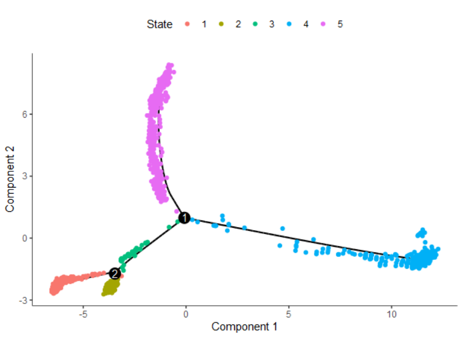
cds <- reduceDimension(cds, method = 'DDRTree')
#排序,得到轨迹分化相关的若干State
cds <- orderCells(cds)
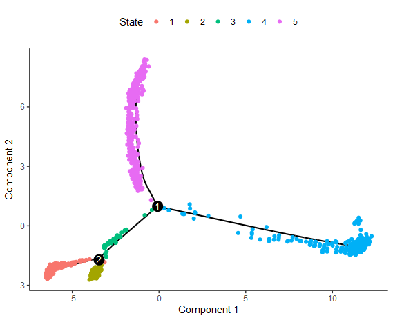
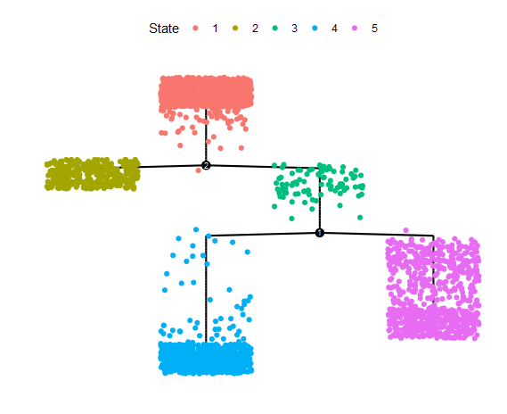
#查看发育阶段State与细胞类型的关系
table(cds$State, cds$celltype)
# celltypeA celltypeB celltypeC celltypeD
# 1 852 3 6 0
# 2 7 334 0 0
# 3 84 4 0 0
# 4 492 10 2 206
# 5 243 1 456 0
|
1
|
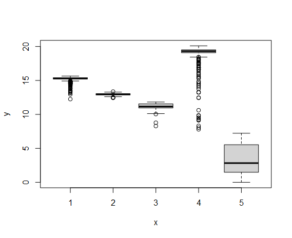
plot(cds$State, cds$Pseudotime)
|
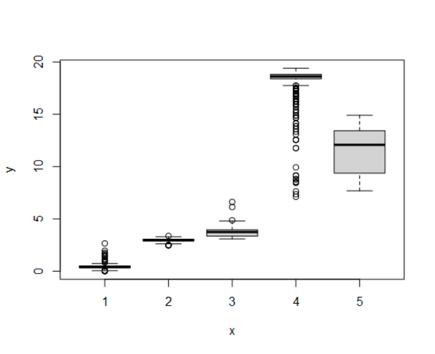
- 可以根据上述的探索,自定义认为最适合作为根节点的State
1
2
|
# cds <- orderCells(cds, root_state = 3)
# plot(cds$State, cds$Pseudotime)
|
3.2 可视化#
(1)细胞群#
1
2
3
4
5
6
|
pData(cds) %>% colnames()
# [1] "orig.ident"      "nCount_RNA"      "nFeature_RNA"    "RNA_snn_res.0.1"
# [5] "RNA_snn_res.0.5" "RNA_snn_res.0.8" "seurat_clusters" "celltype"
# [9] "Size_Factor"     "Pseudotime"      "State"

plot_cell_trajectory(cds, color_by = "State")
|
1
|
plot_complex_cell_trajectory(cds, color_by = "State")
|
1
2
|
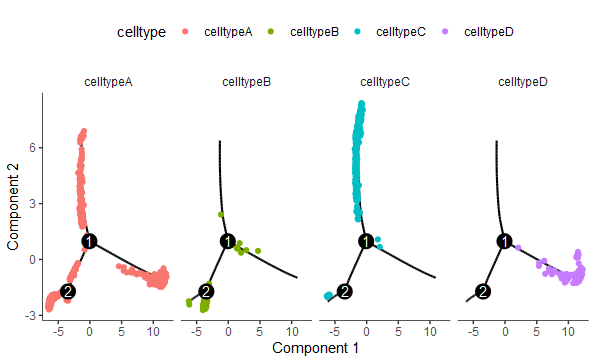
plot_cell_trajectory(cds, color_by = "celltype") +
  facet_wrap("~celltype", nrow = 1)
|
1
|
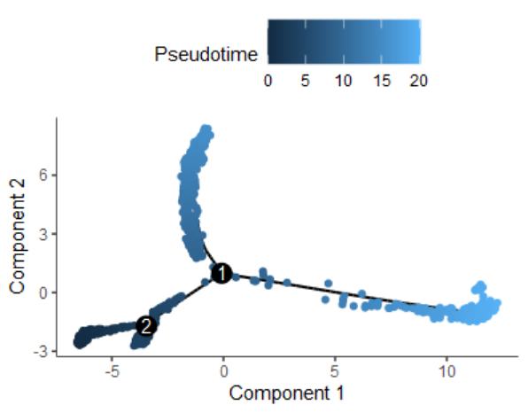
plot_cell_trajectory(cds, color_by = "Pseudotime")
|
(2)基因变化#
1
2
3
|
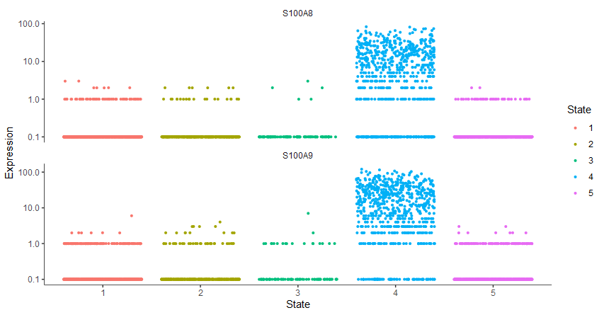
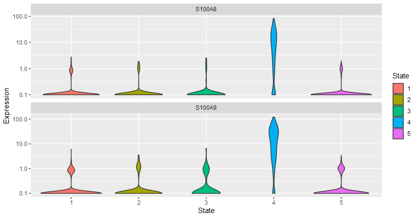
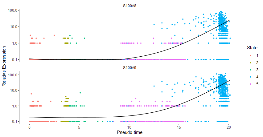
gene_key = c("S100A8","S100A9")
plot_genes_jitter(cds[gene_key,],
                  grouping = "State", color_by = "State")
|
1
2
|
plot_genes_violin(cds[gene_key,],
                  grouping = "State", color_by = "State")
|
1
|
plot_genes_in_pseudotime(cds[gene_key,], color_by = "State")
|
4、差异分析#
4.1 鉴定轨迹分化相关基因#
1
2
3
4
5
6
7
8
9
|
diff_pseudo <- differentialGeneTest(cds[gene_sle,], cores = 1,
                                  fullModelFormulaStr = "~sm.ns(Pseudotime)")
head(diff_pseudo)
#          status           family          pval          qval gene_short_name use_for_ordering
# NKG7         OK negbinomial.size 4.773294e-106 4.876296e-104            NKG7             TRUE
# CD79B        OK negbinomial.size  1.740103e-20  1.431161e-19           CD79B             TRUE
table(diff_pseudo$qval<0.05)
# FALSE  TRUE
#   568  1373
|
 1
 2
 3
 4
 5
 6
 7
 8
 9
10
11
12
13
14
15
16
|
diff_pseudo_gene <- diff_pseudo %>%
dplyr::arrange(qval) %>%
rownames() %>% head(50)
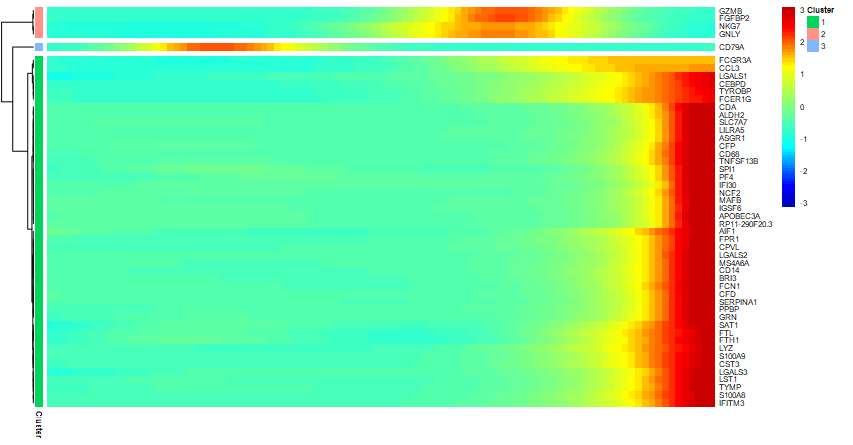
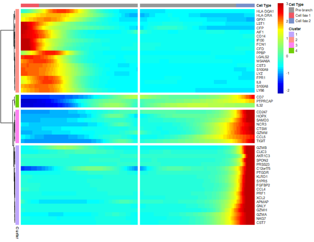
p = plot_pseudotime_heatmap(cds[diff_pseudo_gene,],
num_clusters = 3, # default 6
return_heatmap=T)
#获得具体每个cluster的组成基因
pseudotime_clusters <- cutree(p$tree_row, k = 2) %>%
data.frame(gene = names(.), cluster = . )
head(pseudotime_clusters)
# gene cluster
# S100A9 S100A9 1
# S100A8 S100A8 1
table(pseudotime_clusters$cluster)
# 1 2 3
# 45 4 1
|
4.2 分支点基因变化情况#
简单来说,针对某一个分支点(branch),比较在出现分支后两类细胞的基因表达差异。这类差异包含两个方面(1)与分叉点之前细胞表达的差异;(2)分叉点后的两类细胞间的差异。
举例来说:对于branch1,出现了State 5与4两个分支点。就来比较相对于State 1,3,这两个分支群细胞的差异性。
1
2
3
4
5
6
7
|
BEAM_res <- BEAM(cds[gene_sle], branch_point = 1, cores = 1)
BEAM_res <- BEAM_res[order(BEAM_res$qval),]
BEAM_res <- BEAM_res[,c("gene_short_name", "pval", "qval")]
head(BEAM_res)
#        gene_short_name          pval          qval
# GZMB              GZMB 1.128213e-111 2.189861e-108
# GNLY              GNLY 3.421968e-102  3.321020e-99
|
1
2
3
|
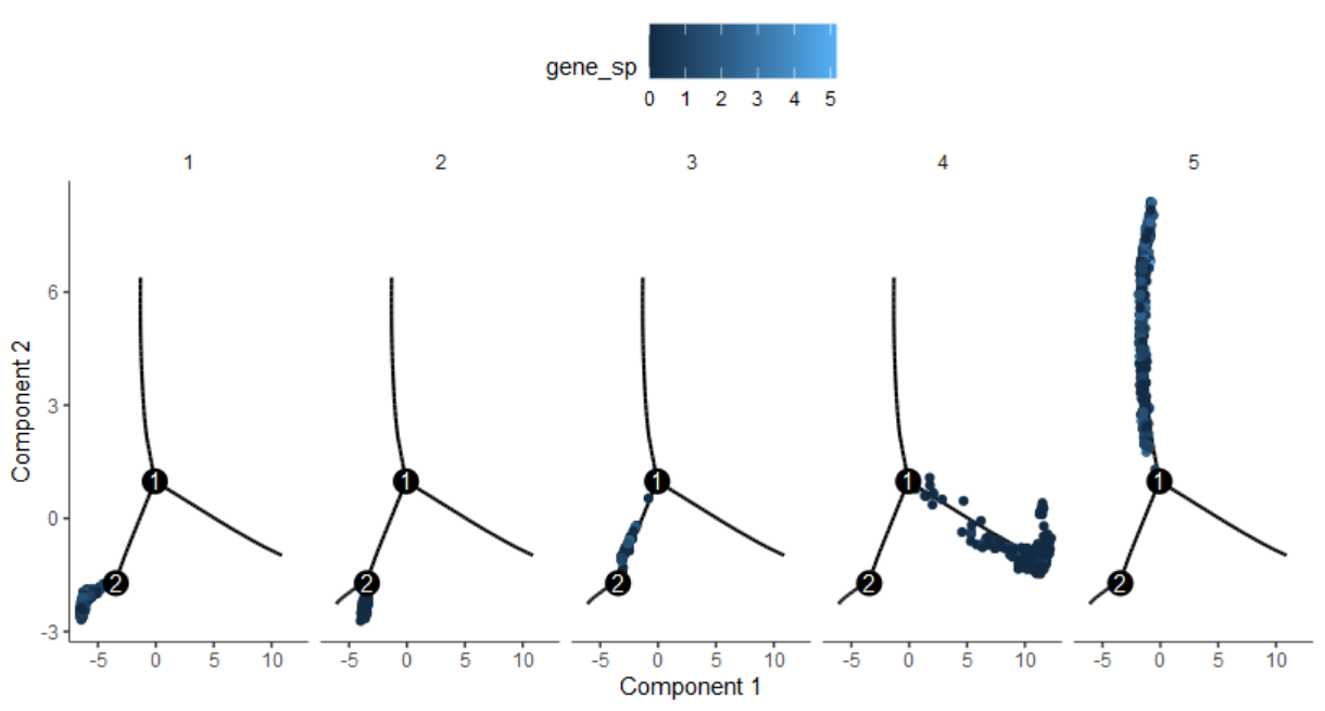
pData(cds)$gene_sp = log2(exprs(cds)['CD7',]+1)
plot_cell_trajectory(cds, color_by = "gene_sp")  +
  facet_wrap("~State", nrow = 1)
|
二、monocle3#
0、Seurat前期分析#
 1
 2
 3
 4
 5
 6
 7
 8
 9
10
11
12
13
14
15
16
17
18
19
20
21
22
23
24
25
26
27
28
29
30
31
32
33
34
|
## 下载示例数据
download.file("https://s3-us-west-2.amazonaws.com/10x.files/samples/cell/pbmc3k/pbmc3k_filtered_gene_bc_matrices.tar.gz",
              "pbmc3k_filtered_gene_bc_matrices.tar.gz")
untar("pbmc3k_filtered_gene_bc_matrices.tar.gz")
library(Seurat)
sce <- Read10X(data.dir = "filtered_gene_bc_matrices/hg19/")
sce <- CreateSeuratObject(sce)
sce = sce %>%
  NormalizeData() %>%
  FindVariableFeatures() %>%
  ScaleData()
sce = sce %>%
  RunPCA() %>%
  RunUMAP(dims = 1:30) %>%  #RunTSNE
  FindNeighbors(dims = 1:30) %>%
  FindClusters(resolution = c(0.1,0.5,0.8))

# 注释细胞类型(随便虚拟命名)
Idents(sce)="RNA_snn_res.0.5"
table(sce@active.ident)
sce$celltype = dplyr::case_when(
  sce@active.ident %in% c(0,1) ~ "celltypeA",
  sce@active.ident %in% c(2) ~ "celltypeB",
  sce@active.ident %in% c(3,4) ~ "celltypeC",
  sce@active.ident %in% c(5,6,7) ~ "celltypeD")
table(sce$celltype)
# celltypeA celltypeB celltypeC celltypeD
# 1678       352       464       206

sce
# An object of class Seurat
# 32738 features across 2700 samples within 1 assay
# Active assay: RNA (32738 features, 2000 variable features)
# 2 dimensional reductions calculated: pca, umap
|
1、构建cds对象#
 1
 2
 3
 4
 5
 6
 7
 8
 9
10
11
12
13
14
15
16
|
#count表达矩阵
expr_matrix = GetAssayData(sce, slot = "counts")
#cell meta注释信息
p_data <- sce@meta.data
head(p_data)
# gene meta注释信息
f_data <- data.frame(gene_short_name = row.names(sce),
                     row.names = row.names(sce))
pre_cds <- new_cell_data_set(expr_matrix,
                         cell_metadata = p_data,
                         gene_metadata = f_data)
pData(pre_cds) %>% colnames()
# [1] "orig.ident"      "nCount_RNA"      "nFeature_RNA"    "RNA_snn_res.0.1"
# [5] "RNA_snn_res.0.5" "RNA_snn_res.0.8" "seurat_clusters" "celltype"
# [9] "Size_Factor"
cds <- preprocess_cds(pre_cds)  #标准化+PCA降维
|
2、UMAP降维#
1
2
3
4
5
6
7
8
9
|
cds <- reduce_dimension(cds, preprocess_method = "PCA")
head(cds@int_colData$reducedDims$UMAP)
# [,1] [,2]
# AAACATACAACCAC-1 -3.571852 3.5445674
# AAACATTGAGCTAC-1 -3.765824 -12.2549407
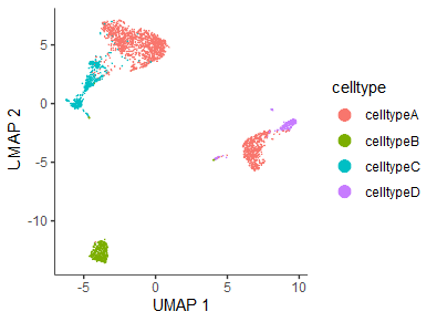
plot_cells(cds, reduction_method="UMAP",
show_trajectory_graph = FALSE,
label_cell_groups = FALSE,
color_cells_by="celltype")
|
1
2
3
4
5
6
|
seurat_umap <- Embeddings(sce, reduction = "umap")[colnames(cds),]
cds@int_colData$reducedDims$UMAP <- seurat_umap
head(cds@int_colData$reducedDims$UMAP)
#                     UMAP_1    UMAP_2
# AAACATACAACCAC-1 -3.916352 -8.065296
# AAACATTGAGCTAC-1 -2.270202 20.887603
|
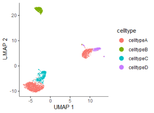
如果想保持跟之前Seurat的分析可视化结果一致,可以使用第二种结果。后面的分析采用第一种结果
3、轨迹分析(核心)#
 1
 2
 3
 4
 5
 6
 7
 8
 9
10
11
|
#分群(类似monocle的State)
cds <- cluster_cells(cds)
#预测轨迹
cds <- learn_graph(cds)
#交互式确定root节点,可以选择多个。我这里选择了一个
cds <- order_cells(cds)

plot_cells(cds, color_cells_by = "pseudotime",
           label_cell_groups = FALSE,
           label_leaves = FALSE,
           label_branch_points = FALSE)
|
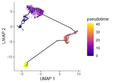
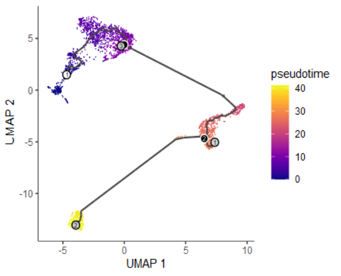
- 参数设置:(1)
label_branch_points=TRUE表示branch分支点,用黑色圆圈,白色边框表示;(2)label_leaves=TRUE表示fate分支终点,用灰色圆圈,黑色边框表示
4、鉴定轨迹分化相关基因#
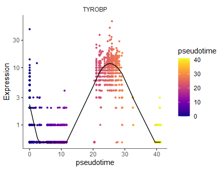
Monocle3 introduces a new approach for finding such genes that draws on a powerful technique in spatial correlation analysis, the Moran’s I test. Moran’s I is a measure of multi-directional and multi-dimensional spatial autocorrelation. The statistic tells you whether cells at nearby positions on a trajectory will have similar (or dissimilar) expression levels for the gene being tested. Although both Pearson correlation and Moran’s I ranges from -1 to 1, the interpretation of Moran’s I is slightly different: +1 means that nearby cells will have perfectly similar expression; 0 represents no correlation, and -1 means that neighboring cells will be anti-correlated.
 1
 2
 3
 4
 5
 6
 7
 8
 9
10
|
#相对比较耗时
Track_genes <- graph_test(cds, neighbor_graph="principal_graph")
Track_genes <- Track_genes[,c(5,2,3,4,1,6)] %>%
dplyr::arrange(desc(morans_I),q_value)
head(Track_genes)
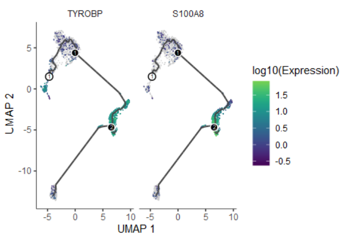
# gene_short_name p_value morans_test_statistic morans_I status q_value
# TYROBP TYROBP 0 148.7535 0.8395583 OK 0
# S100A8 S100A8 0 146.4378 0.8261901 OK 0
plot_genes_in_pseudotime(cds[Track_genes$gene_short_name[1],] ,
min_expr=0.5)
|
1
2
3
4
|
plot_cells(cds, genes=Track_genes$gene_short_name[1:2],
           show_trajectory_graph=TRUE,
           label_cell_groups=FALSE,
           label_leaves=FALSE)
|