1
2
3
4
import matplotlib.pyplot as plt
import seaborn as sns
import numpy as np
import pandas as pd

1. sns.heatmap

  • 绘制的热图是固定行列的表格,不可以调整顺序
 1
 2
 3
 4
 5
 6
 7
 8
 9
10
11
12
13
14
15
16
17
18
19
20
21
22
23
24
25
# glue = sns.load_dataset("glue").pivot(index="Model", columns="Task", values="Score")
# https://github.com/mwaskom/seaborn-data/blob/master/glue.csv
glue = pd.read_csv("./data/glue.csv").pivot(index="Model", columns="Task", values="Score")
glue.head()
# Task         CoLA  MNLI  MRPC  QNLI   QQP   RTE  SST-2  STS-B
# Model                                                        
# BERT         60.5  86.7  89.3  92.7  72.1  70.1   94.9   87.6
# BiLSTM       11.6  65.6  81.8  74.6  62.5  57.4   82.8   70.3
# BiLSTM+Attn  18.6  67.6  83.9  74.3  60.1  58.4   83.0   72.8
# BiLSTM+CoVe  18.5  65.4  78.7  70.8  60.6  52.7   81.9   64.4
# BiLSTM+ELMo  32.1  67.2  84.7  75.5  61.1  57.4   89.3   70.3


# 1)
plt.figure(figsize=(4, 3))
sns.heatmap(glue)
plt.show()


# 2) 为单元格添加注释数据
plt.figure(figsize=(4, 3))
sns.heatmap(glue, annot=True,
            # fmt=".1f"  #  可以设置数据格式
            # annot=glue.rank(axis=1)  # 也可以自定注释内容
            )
image-20250728213912620
1
2
3
4
5
6
7
8
9
# 3) 设置边框
plt.figure(figsize=(4, 3))
sns.heatmap(glue, annot=True, linewidth=.5, linecolor="white", square=True)

# 4) 指定色域以及映射范围
plt.figure(figsize=(4, 3))
sns.heatmap(glue, cmap="crest", vmin=50, vmax=100)

# 最后也可以通过cbar系列参数调整颜色条

image-20250728214104341

2. sns.clustermap

 1
 2
 3
 4
 5
 6
 7
 8
 9
10
11
12
13
14
15
16
17
18
19
20
21
22
23
24
25
26
27
28
29
30
31
32
33
34
35
36
37
38
39
40
41
42
43
44
45
46
47
48
49
50
51
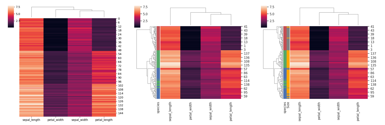
iris = sns.load_dataset("iris")
species = iris.pop("species")
print(iris.head())
# sepal_length  sepal_width  petal_length  petal_width
# 0           5.1          3.5           1.4          0.2
# 1           4.9          3.0           1.4          0.2
# 2           4.7          3.2           1.3          0.2
# 3           4.6          3.1           1.5          0.2
# 4           5.0          3.6           1.4          0.2

# 1) 自动新建自己的图
sns.clustermap(
    iris, 
    figsize=(6, 6),
    row_cluster=False,           # 是否行聚类
    dendrogram_ratio=(.1, .1),   # 分别设置行列聚类图高度,若设置为0即不显示
)

# 2) 增加一列注释meta
lut = dict(zip(species.unique(), "rbg"))
row_colors = species.map(lut)  # pandas.core.series.Series
row_colors.head()  # index对应热图的列名, value对应颜色
# 0    r
# 1    r
# 2    r
# 3    r
# 4    r
sns.clustermap(
    iris, row_colors=row_colors,
    figsize=(6, 6),
)

# 3) 增加两列注释meta
size_category = pd.Series(
    np.where(iris["sepal_length"] > 5.5, "large", "small"),
    index=iris.index,
    name="Size"
).map({"large": "orange", "small": "gray"})

row_colors2 =pd.concat([row_colors, size_category], axis=1)
print(row_colors2.head())
#   species  Size
# 0       r  gray
# 1       r  gray
# 2       r  gray
# 3       r  gray
# 4       r  gray
sns.clustermap(
    iris, row_colors=row_colors2,
    figsize=(6, 6),
)

image-20250728214904210

 1
 2
 3
 4
 5
 6
 7
 8
 9
10
11
12
13
14
15
16
17
18
19
20
21
22
23
24
# 4) 调整色域
sns.clustermap(
    iris, cmap="mako", vmin=0, vmax=10,
    figsize=(6, 6),
)


# 5) 距离以及聚类计算方式
# metric: 样本点与点之间距离计算方式, 默认为 "euclidean"
# method: 层次聚类时,合并类的方式,默认为 "average"
sns.clustermap(
    iris, 
    metric="correlation",
    method="average",
    figsize=(6, 6)
)

# 6) 在聚类前,先对数据按行0或列1进行归一化处理
sns.clustermap(
    iris, 
    standard_scale=1, # 对列进行最大最小值(0~1)归一化
    # z_score=1,      # 对列进行均值方差归一化
    figsize=(6, 6)
)

image-20250728215440360

 1
 2
 3
 4
 5
 6
 7
 8
 9
10
11
12
13
14
15
16
17
18
19
20
21
22
23
24
25
26
27
28
29
30
31
32
33
34
35
36
37
38
39
40
41
42
43
44
# 7) 提取聚类后的热图表格数据
g = sns.clustermap(
    iris
)

row_order = g.dendrogram_row.reordered_ind
col_order = g.dendrogram_col.reordered_ind

clustered_iris = iris.iloc[row_order, col_order]
print("# 聚类前Df:")
print(iris.head())

# # 聚类前Df:
#    sepal_length  sepal_width  petal_length  petal_width
# 0           5.1          3.5           1.4          0.2
# 1           4.9          3.0           1.4          0.2
# 2           4.7          3.2           1.3          0.2
# 3           4.6          3.1           1.5          0.2
# 4           5.0          3.6           1.4          0.2


print("# 聚类后Df:")
print(clustered_iris.head())
# # 聚类后Df:
#     sepal_length  petal_width  sepal_width  petal_length
# 41           4.5          0.3          2.3           1.3
# 14           5.8          0.2          4.0           1.2
# 15           5.7          0.4          4.4           1.5
# 32           5.2          0.1          4.1           1.5
# 33           5.5          0.2          4.2           1.4


# 8) 提取聚类的类别结果

from scipy.cluster.hierarchy import fcluster

row_clusters = fcluster(g.dendrogram_row.linkage, t=3, criterion='maxclust')
print(pd.Series(row_clusters, index=iris.index[row_order]).head())
# 41    1
# 14    1
# 15    1
# 32    1
# 33    1
# dtype: int32

3. 相关性聚类热图

 1
 2
 3
 4
 5
 6
 7
 8
 9
10
11
12
13
14
15
16
17
18
19
20
21
22
23
24
25
26
27
28
29
30
31
32
df = sns.load_dataset("brain_networks", header=[0, 1, 2], index_col=0)
used_networks = [1, 5, 6, 7, 8, 12, 13, 17]
used_columns = (df.columns.get_level_values("network")
                          .astype(int)
                          .isin(used_networks))
df = df.loc[:, used_columns]
df.columns = df.columns.map("-".join)
df.shape
# (890, 38)   38个样本,每个样本有890个特征
df.head()

# 设置每行所属类别的颜色
classes = np.unique([col.split("-")[0] for col in df.columns]) # 8个类别
network_pal = sns.husl_palette(8, s=.45)  # 8类颜色,饱和度为0.45

network_lut = dict(zip(classes, network_pal))  # dict
metadata = pd.DataFrame({"sample":df.columns})
metadata["group"] = metadata["sample"].apply(lambda x: str(x.split("-")[0]))
metadata["group"] = metadata["group"].map(network_lut)
metadata = metadata.set_index("sample")
metadata.head()


# Draw the full plot
g = sns.clustermap(df.corr(), 
                   center=0,    # 配色方案的中心(白色)对应的value值(0)
                   cmap="vlag",
                   row_colors=metadata, 
                   col_colors=metadata,
                   linewidths=.1, figsize=(6, 6))

g.ax_row_dendrogram.remove()
image-20250728220207091

4. 相关性聚类点图

 1
 2
 3
 4
 5
 6
 7
 8
 9
10
11
12
13
14
15
16
17
18
19
20
21
22
23
24
25
corr_mat = df.corr().stack().reset_index(name="correlation")
print(corr_mat.head())
# level_0 level_1  correlation
# 0  1-1-lh  1-1-lh     1.000000
# 1  1-1-lh  1-1-rh     0.878799
# 2  1-1-lh  5-1-lh     0.429808
# 3  1-1-lh  5-1-rh     0.415781
# 4  1-1-lh  6-1-lh    -0.081381

# Draw each cell as a scatter point with varying size and color
g = sns.relplot(
    data=corr_mat,
    x="level_0", y="level_1", 
    hue="correlation", size="correlation",
    hue_norm=(-1, 1), size_norm=(-.2, .8), sizes=(10, 50),
    palette="vlag", edgecolor=".7",
    height=6, 
)

# Tweak the figure to finalize
g.ax.tick_params(axis='x', labelsize=8, rotation=90)
g.ax.tick_params(axis='y', labelsize=8)
g.set(xlabel="", ylabel="", aspect="equal")  # 横纵坐标比例
g.despine(left=True, bottom=True)            # 去除左边和底部的轴线
g.ax.margins(.02)                            # 设置图形边缘留白
image-20250728220402839