- 官方教程链接:https://seaborn.pydata.org/tutorial.html
1
2
3
4
|
import seaborn as sns
import matplotlib.pyplot as plt

import pandas as pd
|
1. theme主题设置#
context: 用于调整整体字体和标注的大小
- “paper”, “notebook”,“talk”, “poster”
style: 用于调整背景和网格线
- “whitegrid”, “darkgrid”, “white”, “dark”, “ticks”
1
2
|
# 默认设置 (全局声明,对后面所有绘图有效)
sns.set_theme(context='notebook', style='darkgrid')
|
 1
 2
 3
 4
 5
 6
 7
 8
 9
10
11
12
13
14
15
16
17
18
19
20
21
22
23
24
25
26
27
28
29
30
|
plt.figure(figsize=(4, 4))

sns.set_theme(context='paper', style='white')
# sns.set_theme(context='paper', style='ticks')


plt.rcParams['font.size'] = 12
plt.rcParams['axes.labelsize'] = 13
plt.rcParams['axes.titlesize'] = 15
plt.rcParams['xtick.labelsize'] = 10
plt.rcParams['ytick.labelsize'] = 10
# plt.rcParams['axes.facecolor'] = 'lightgray' # 绘图区域的背景(数据显示区域)
# plt.rcParams['figure.facecolor'] = 'white'   # 图形其余的背景(包括边距)

# 适合发表的风格

sns.barplot(
    data=df,
    x='x', y='y', hue='category'
)

sns.despine()  # 移除右侧与上侧的边框

plt.legend(loc='upper left', borderaxespad=0.5, frameon=False)

# plt.xlabel("x label", fontsize=15)

plt.savefig('test.png', dpi=300, bbox_inches='tight')
# plt.savefig('test.pdf', dpi=300, bbox_inches='tight')
|
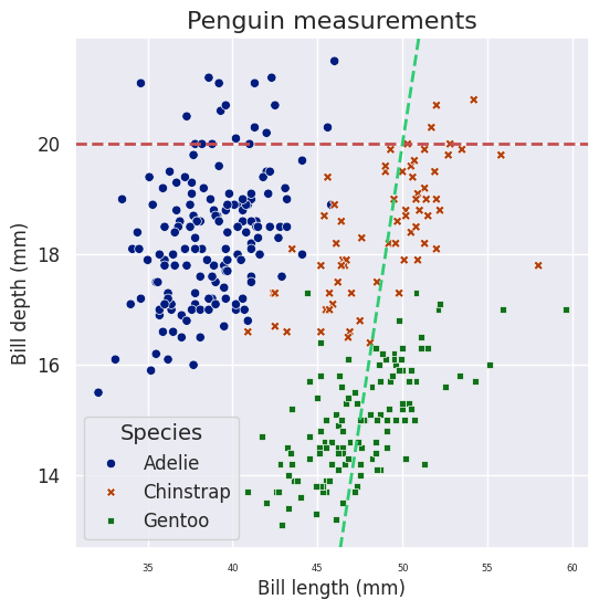
2. 散点图示例#
1
2
3
4
5
|
# Demo data: 企鹅数据集
# df = sns.load_dataset("penguins")
df = pd.read_csv("./seaborn-data-master/penguins.csv")

df.head()
|
 1
 2
 3
 4
 5
 6
 7
 8
 9
10
11
12
13
14
15
16
17
18
19
20
21
22
23
24
25
26
27
28
29
30
31
32
|
plt.figure(figsize=(6, 6)) # 默认是[6.4, 4.8]

# axis-level
sns.scatterplot(data=df,
                x="bill_length_mm", y="bill_depth_mm",
                hue="species", style="species", palette="dark",
                # linewidth=0,   # 点的外轮廓
                # alpha = 0.5,   # 点的不透明度
                # s = 10         # 点的绝对大小
                # size = "var"   # 大小与变量列进行映射
               )

# 标题
plt.title("Penguin measurements", fontsize=16)
plt.xlabel("Bill length (mm)")
plt.ylabel("Bill depth (mm)")
plt.xticks(fontsize=6)
plt.yticks(fontsize=12)

# 图例
plt.legend(fontsize=12, title="Species", title_fontsize=14)

# 添加参考线 y = 20
plt.axhline(y=20, color='r', linestyle='--', linewidth=2, label="Reference Line (y=20)")
# 添加参考线 y = y = 2x + 5
plt.axline((50, 20), slope=2, color="#2ECC71", linestyle="--", linewidth=2, label="y = 2x + 5")

# # 保存图片
# plt.savefig("scatterplot.pdf")

# 展示
plt.show()
|
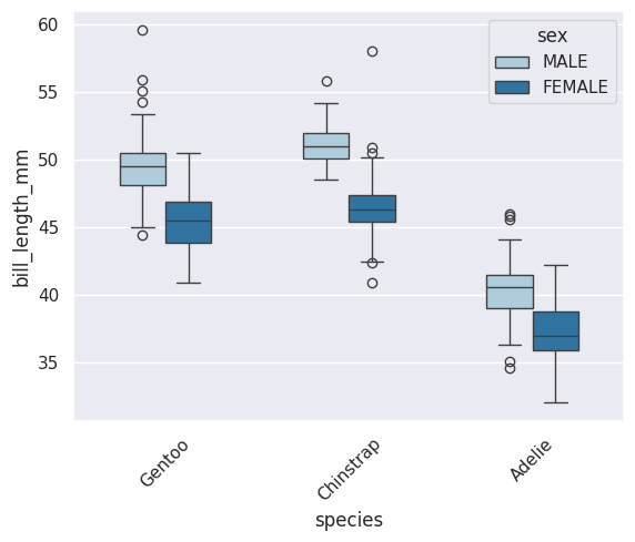
3. 箱图示例#
 1
 2
 3
 4
 5
 6
 7
 8
 9
10
11
12
13
14
15
16
17
18
19
20
21
22
23
24
|
# # 可以提前修改分类列的因子顺序
# species_order = ["Gentoo", "Chinstrap", "Adelie"]
# df["species"] = pd.Categorical(df["species"], categories=species_order, ordered=True)

sns.boxplot(data=df, x="species", y="bill_length_mm",
            hue="sex", order=["Gentoo", "Chinstrap", "Adelie"],
            width=0.5, # 默认 0.8
            showfliers=True, # 显示离群点
            # flierprops = dict(marker='o', markerfacecolor='red', markersize=3), #离群点显示效果
            palette="Paired")

plt.xticks(rotation=45, fontweight='bold')           # 旋转45度,且加粗
plt.xticks(rotation=90)           # 垂直
plt.xticks(rotation=45, ha='right')  # 右对齐(常用于斜标签)

# 修改 x 轴标签
plt.xticks([0, 1, 2], ['标签A', '标签B', '标签C'])
# 修改 y 轴标签
plt.yticks([0, 10, 20, 30], ['零', '十', '二十', '三十'])


# plt.legend().remove() # 删除legend

plt.show()
|
 1
 2
 3
 4
 5
 6
 7
 8
 9
10
11
12
13
|
# 将legend放在图外右侧
ax = sns.boxplot(...)
ax.legend(
    bbox_to_anchor=(1.02, 1),   # legend 锚点的位置, 想把legend设置在外部时经常用到
    loc="upper left",           # legend的哪个部分处于锚点坐标的位置
)

# 移到右侧外部
plt.legend(bbox_to_anchor=(1.05, 1), loc='upper left')
# 移到底部外部
plt.legend(bbox_to_anchor=(0.5, -0.15), loc='upper center', ncol=3)
# 移到顶部外部
plt.legend(bbox_to_anchor=(0.5, 1.15), loc='upper center', ncol=2)
|
常用的 loc 参数值:
'best' - 自动选择最佳位置(默认,值为 0) 'upper right' - 右上角(值为 1)
'upper left' - 左上角(值为 2) 'lower left' - 左下角(值为 3) 'lower right' - 右下角(值为 4)
'right' - 右侧中间(值为 5) 'center left' - 左侧中间(值为 6) 'center right' - 右侧中间(值为 7)
'lower center' - 底部中间(值为 8) 'upper center' - 顶部中间(值为 9) 'center' - 中心(值为 10)
1
2
3
4
5
|
# 控制 legend 边框到坐标轴的填充距离, 感觉是把legend放在内部时更常用一些
plt.legend(loc='upper right', borderaxespad=0)    # 紧贴坐标轴
plt.legend(loc='upper right', borderaxespad=0.5)  # 默认,有一点间距
plt.legend(loc='upper right', borderaxespad=2)    # 较大间距
# 这是一个额外的偏移量,在 bbox_to_anchor 基础上再调整。
|
 1
 2
 3
 4
 5
 6
 7
 8
 9
10
11
|
# 其它设置
plt.legend(
    loc='upper right',
    frameon=True,           # 显示边框
    fancybox=True,          # 圆角边框
    shadow=True,            # 阴影
    ncol=2,                 # 分成2列
    fontsize=10,            # 字体大小
    title='Category',       # 标题
    title_fontsize=12       # 标题字体大小
)
|
4. 柱状图/线图(误差棒)#
 1
 2
 3
 4
 5
 6
 7
 8
 9
10
11
12
13
|
fig, axes = plt.subplots(1, 2, figsize=(14, 6))  # figsize 设置整个图形的大小

sns.barplot(data=df, x="species", y="bill_length_mm",
            errorbar="sd", ax=axes[0])  # 将ax传递给sns.barplot
axes[0].set_title("Bar Plot with Standard Deviation")
sns.lineplot(data=df, x="species", y="bill_length_mm",
             errorbar="pi", ax=axes[1])  # 将ax传递给sns.lineplot
axes[1].set_title("Line Plot with Prediction Interval")

# 自动调整布局
plt.tight_layout()
# 显示图形
plt.show()
|
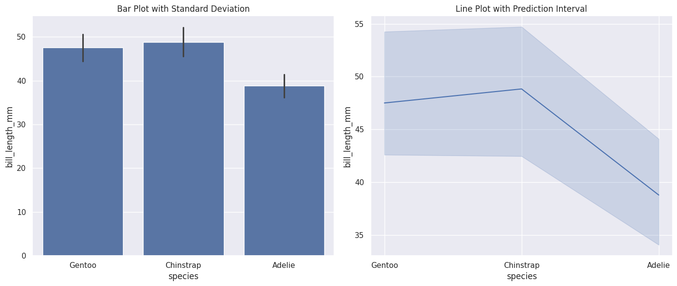
Seaborn支持四种类型的误差棒,分别是"sd", “se”, “pi”, “ci” (默认为ci) 具体区别参见教程。
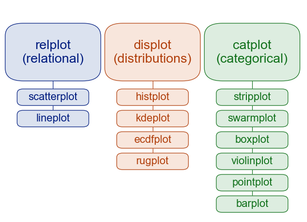
- sns.relplot等figure-level的绘图函数是广义的,sns.scatterplot等axis-level的绘图函数是Specific。可以通过
kind参数,设置具体的几何绘图类型
- 二者从可视化角度的区别在与legend的位置
1
2
3
4
5
|
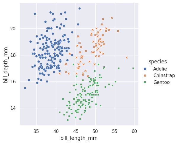
# 如下图所示,最大区别是legend的位置
sns.relplot(data=df, kind="scatter",
                x="bill_length_mm", y="bill_depth_mm",
                hue="species", style="species")
plt.show()
|
- 此外,可以通过col/row参数方便的设置分面(axis-level funcs不支持)
1
2
3
4
|
sns.relplot(data=df, kind="scatter",
                x="bill_length_mm", y="bill_depth_mm",
                hue="species", style="species", col="species")
plt.show()
|
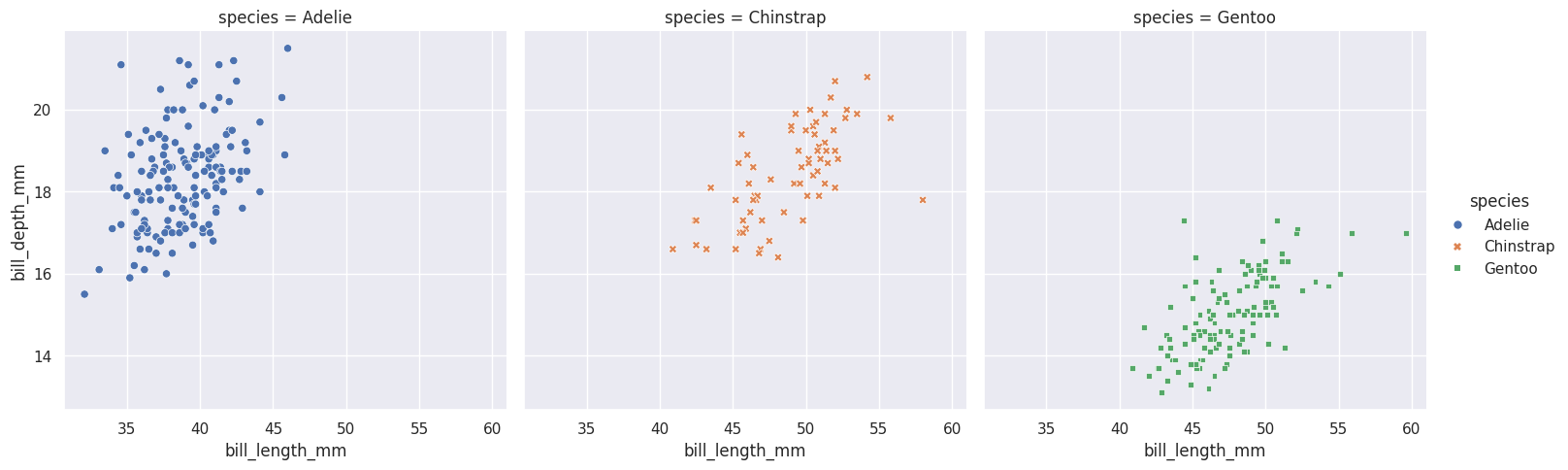
关于分面,可以通过sns.FacetGrid()绘制axis-level的分面绘图
6. 色板#
palette参数: 用于调整颜色系。下面的示例展示效果见教程。
- 分类调色板(Qualitative)
- “deep”, “muted”, “pastel”, “bright”, “dark”, “colorblind”
- Set1, Set2, Set3
- Paired
- “Set1”,“Set2”, “Set3”, “Paired”, “Accent”, “Dark2”, “Pastel1”, “Pastel2” …
- tab10, tab20, tab20b, tab20
- 直接自定义:palette = ["#E74C3C", “#3498DB”, “#2ECC71”]
- 连续调色板(Sequential, 从浅到深单向渐变)
Blues, Greens, Reds, Oranges, Purples, Greys
YlOrBr, YlOrRd, OrRd, PuRd, RdPu, BuPu, GnBu, PuBu, YlGnBu, PuBuGn, BuGn, YlGn
binary, gist_yarg, gist_gray, gray, bone, pink
viridis, plasma, inferno, magma, cividis
- 发散调色板(Diverging, 从两端向中间双向渐变)
RdBu, RdGy, PRGn, PiYG, BrBG, RdYlBu, RdYlGn, Spectral
coolwarm, bwr, seismic
7. 拼图#
 1
 2
 3
 4
 5
 6
 7
 8
 9
10
11
12
13
14
15
16
17
18
19
20
21
22
23
24
25
26
27
28
29
|
import seaborn as sns
import matplotlib.pyplot as plt
import pandas as pd

df = pd.DataFrame({
    'x': ['A', 'B', 'C'] * 2,
    'y': [1, 2, 3, 2, 3, 4],
    'category': ['Cat1']*3 + ['Cat2']*3
})

fig, axes = plt.subplots(1, 3, figsize=(15, 4))

# borderaxespad=0(紧贴)
axes[0].set_title('borderaxespad=0')
sns.barplot(data=df, x='x', y='y', hue='category', ax=axes[0])
axes[0].legend(loc='upper right', borderaxespad=0)

# borderaxespad=0.5(默认)
axes[1].set_title('borderaxespad=0.5 (默认)')
sns.barplot(data=df, x='x', y='y', hue='category', ax=axes[1])
axes[1].legend(loc='upper right', borderaxespad=0.5)

# borderaxespad=2(较大间距)
axes[2].set_title('borderaxespad=2')
sns.barplot(data=df, x='x', y='y', hue='category', ax=axes[2])
axes[2].legend(loc='upper right', borderaxespad=2)

plt.tight_layout()
plt.show()
|
8. grid 网格线#
1
2
3
4
5
6
7
8
|
plt.grid(
    True,
    axis='y',  # "both", "x"
    linestyle='--',      # 线型:'-', '--', '-.', ':', ''
    linewidth=0.5,       # 线宽
    color='red',        # 颜色
    alpha=0.3            # 透明度 (0-1)
)
|